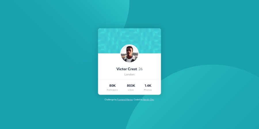
Design comparison
SolutionDesign
Community feedback
- @Bayoumi-devPosted over 2 years ago
Hey! It looks good!... Here are some suggestions:
Page should contain a level-one heading, Changeh3toh1You should always have oneh1per page of the document... in this challenge, you will useh1just to avoid theaccessibility issuethat appears in the challenge report... but don't useh1on small components<h1>should represent the main heading for the whole page, and for the best practice use only one<h1>per page.- I suggest you put the status of the profile card into the
list itemto add moresemanticsto your project,Div's don't do much for semantics but a list is much more meaningful..:
<ul class="stats"> <li><span class="stats-num">80K</span>Followers</li> <li><span class="stats-num">803K</span>Likes</li> <li><span class="stats-num"> 1.4K</span>Photos</li> </ul>- Use
REMfor font size, It is a must for accessibility because px in some browsers doesn't resize when the browser settings are changed... See this article ---> CSS REM – What is REM in CSS?
I hope this is helpful to you... Keep coding👍
Marked as helpful1 - @banditdev013Posted over 2 years ago
Hi! Ahmed Bayoumi.
I thank you very much for your advice. I have already edited this challenge as per your suggestion.
thanks again 🙂
0
Please log in to post a comment
Log in with GitHubJoin our Discord community
Join thousands of Frontend Mentor community members taking the challenges, sharing resources, helping each other, and chatting about all things front-end!
Join our Discord
