Design comparison
Solution retrospective
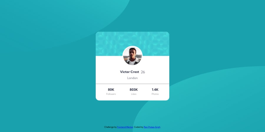
I had tried my best to design using the images provided . Could anyone please help me in designing the background more accurately and precisely of this challenge?
Community feedback
- @AdrianX19Posted about 3 years ago
Hi @cyberspatial!
The other way to bite this patterns in the background would be to use background-image to the body (it accepts multiple arguments) and then you can use background-position to place the circles wherever you want :) also I would suggest to use <main> tag for your card container instead of a <div>.
All in all really good job! :)
Marked as helpful2 - @DrougnovPosted about 3 years ago
Hello @cyberspatial, great job. You can add the patterns by using pseudo-classes(
:: before,:: after) to the body. Try this:body{ position:relative } body::before { background: url(./images/bg-pattern-top.svg) no-repeat bottom right; top: 0; left: 0; } body::after { background: url(./images/bg-pattern-bottom.svg) no-repeat top left; top: 100%; left: 100%; }It's probably the most efficient way. Also here are something you might wanna consider to change/add:
- The card looks much wider than the actual design. So add
max-widthto the card to fix that. - You need to start with level one heading(h1). That means you cannot start with lower(h2,h3, etc). Don't use the
sectionorarticletag if there is no child heading. Use div instead.
Overall your design looks great. Have a great day :)
Marked as helpful2 - The card looks much wider than the actual design. So add
Please log in to post a comment
Log in with GitHubJoin our Discord community
Join thousands of Frontend Mentor community members taking the challenges, sharing resources, helping each other, and chatting about all things front-end!
Join our Discord
