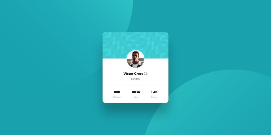
Design comparison
Solution retrospective
I struggled a lot with the positioning of background images. The current version has hardcoded positioning coordinates that are relative to the 1440px/720px and 375px/721px screens. Beyond those dimentions the images look off.
Any advice on how I can make it more reponsive to the screens?
Community feedback
- @isprutfromuaPosted about 3 years ago
Hi there. You did a good job 😎
🛠️
keep improving your programming skills
your solution looks great, however, if you want to improve it, you can follow these steps:
✅ don't use tag selectors. When you add CSS directly on tags, your markup can’t change. Your style is tightly coupled to your DOM, and any change increases the risk of breaking things.
✅ place the Google import code such that it loads first directly after the html HEAD tag, EVEN before loading the CSS file. This ensures the fonts load before the CSS so there isn't any unexpected "jumping" of when the font finally loads.
✅ choose a naming convention , methodology, or framework and stick to it.
✅ use code formatters for structuring your code. It’s very important. As programs get more complex, they get harder and harder to understand - and at some point you can’t even understand code that you yourself wrote without being able to re-read it. Good style makes reading code a pleasurable and consistent experience.
✅ You Should Stop Using Pixels. They are static and aren’t truly relative to the root font-size like REM and EM units
I hope my feedback will be helpful. You can mark it as useful if so 👍
Good luck and fun coding 🤝⌨️
Marked as helpful0@MabchirPosted about 3 years ago@isprutfromua Thank you so much for your feedback and for your helpful advice.
Some follow up questions:
-
about the tag selectors, are you suggesting I give all elements classes and use those classes in the CSS instead of h1 , p ...
-
about the google import. I tried your suggestion but it's not working for some reason. do you have a link that explains how to properly do it ?
-
I am already using prettier as a code formatter, are you referring to something different ?
-
I am using rem for fonts, do I need to use rem instead of px everywhere?
0 -
- @shashreesamuelPosted about 3 years ago
Hey good job completing this challenge
Keep up the good work
Your solution looks great however I think that the following should be considered
-
lower half of the card below the divider line which displays the number of statistics needs to be in uppercase. You can achieve this using
text-transform: uppercase. -
The name "Victor Crest" appears to be in a heavier font weight upon inspection.
-
The divider line needs less opacity when compared to the design. You can fix this by decreasing the value on the opacity for the relevant selector.
In terms of your accessibility issues simply wrap all your content between main tags to get rid of the issue.
I recommend using semantic tags since it helps with describing the intended usage of the content enclosed within. Here is an article that gives an introduction to semantic tags, how it works and the various tags that can be implemented based on what you are trying to achieve.
I hope this helps
Cheers Happy coding 👍
Marked as helpful0@MabchirPosted about 3 years ago@TheCoderGuru Thanks a lot for your time and feedback ! That's very helpful.
about accessibility, the content is already between a main tags. I am not sure why it's not working
0@shashreesamuelPosted about 3 years agoyour heading levels should only increase by one meaning if you have a
h1tag then the preceding tag should be ah2.I hope this helps
Cheers Happy coding 👍
Marked as helpful0 -
Please log in to post a comment
Log in with GitHubJoin our Discord community
Join thousands of Frontend Mentor community members taking the challenges, sharing resources, helping each other, and chatting about all things front-end!
Join our Discord
