Not Found
Not Found
Not Found
Not Found
Not Found
Not Found
Not Found
Not Found
Not Found
Not Found
Not Found
Not Found
Not Found
Not Found
Not Found
Not Found
Not Found
Not Found
Not Found
Not Found

Submitted

profile-card-component ( Need a feedback regarding my code )

@Priyesh-Singh-Waldia

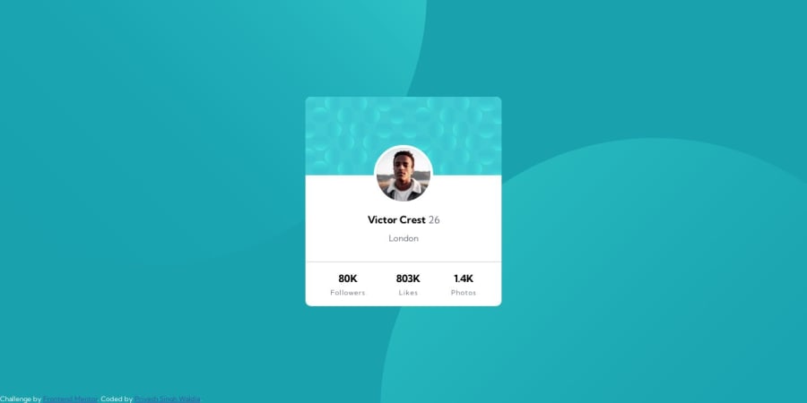
Desktop design screenshot for the Profile card component coding challenge

This is a solution for...

  • HTML
  • CSS
1newbie
View challenge

Design comparison


SolutionDesign

Solution retrospective


Would love to get some feedback on my code.

Community feedback

Boots šŸ˜ŗā€¢ 1,590

@adityaphasu

Posted

Hello @Priyesh-Singh-Waldia!

One thing I noticed is that for the background images you are using absolute while it might be okay in some cases but here it can be done using CSS only!

Here's how you do it: On the body tag we use the background-image property to set both the background URLs separated by a , (we can add multiple images as background using ,) like this:

body{
    background-image: url(images/bg-pattern-top.svg), url(images/bg-pattern-bottom.svg);
    background-repeat: no-repeat;
    background-position: -127% -56vh, 200% 56vh;
    background-size: 75%;
//rest of the styles
   }
  • Let me explain what we did here in the code firstly we use as I said earlier set the URLs for the background images by separating the URLs by ,.
  • background-repeat is used so that the background images don't repeat.
  • In background-position you might have noticed I have used , here too because to differentiate between the two images and set the positions of those accordingly. To easily explain this it's like (first image position), (second image position).
  • But now you might ask why we didn't use , to separate the background-size as well, that's because we want both the images to have the same exact size which is 75%. Think of it as if we don't use the , and just give the property one value then it would get applied to both images. (, to separate the values of individual images)

Some more suggestions you can take into consideration:

  • Instead of using div as a general container for the whole content on the page try using a more semantic tag like <main> while div is quite generic, main tells the search engines that the content inside it is the main content of the page.
  • Instead of using px for font size which is an absolute unit try using rem which is a relative unit and scales well with layouts. (In your case font-size:18px would turn into font-size: 1.125rem). Give this a read and you will understand a lot better.

Everything else apart from a few changes looks good!

Keep up the hard work and happy coding!šŸ™ŒšŸ»

0

Please log in to post a comment

Log in with GitHub
Discord logo

Join our Discord community

Join thousands of Frontend Mentor community members taking the challenges, sharing resources, helping each other, and chatting about all things front-end!

Join our Discord