Design comparison
Solution retrospective
I have just finished my first chalange/first repository and first project. It did not look as difficult to manage it however ....I spent a few hours to complete it :( I have a huge problem to give the name of classes in html structure to be clear. Please, if you have a little time, look at me code. I would be very gratefullfor any feedback. Gosia
Community feedback
- @AgataLiberskaPosted over 3 years ago
Hi @kowackag! This challenge looks really simple but is deceptive, so don't worry that it took you longer than you expected - I think a lot of people (myself definitely included) had the same experience!
Class naming comes with experience, I found it useful to watch a few videos and see what more experience developers do. Also, look up BEM methodology, I find it very helpful (but some people hate it, class names can get long :))
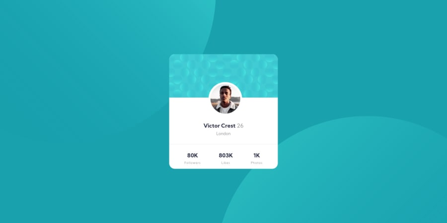
As for your solution, I think the card looks really good both on desktop and mobile, but I would definitely set the background on the body instead of a container (make it full-screen). I also can't see the circles in the mobile design - I think it's a good idea to look through other people's solutions to see how they approached that problem - I definitely saw one that was fantastically simple, it used vh and vw units to position them, but can't fint it right now to tag the person.
A small detail - is the profile image centered on the card? I'm not sure if it's a bit off to one side?
0@kowackagPosted over 3 years ago@AgataLiberska Thank you very much for your response. You are right! The image is not centered. I did not take into account a imagine border. I am going to look through other people's solutions as you said - It's good idea! Thak you once again.
0@AgataLiberskaPosted over 3 years ago@kowackag happy to help :) a good way of centering elements like this would be:
left: 50%; //the left edge of the element is in the centre of the container transform: translateX(-50%); //then we pull the element back by half its width
0@mbart13Posted over 3 years agoI don't know if Agata meant this solution, but definitely check this: https://www.frontendmentor.io/solutions/profile-card-with-pseudo-backgrounds-and-accessible-list-577BPZiIm
It doesn't get better than that
2@AgataLiberskaPosted over 3 years ago@mbart13 it wasn't Grace's solution but I totally agree, there's always so much to learn from her work! And the positioning of the backgrounds was very similar :)
0@kowackagPosted over 3 years ago@mbart13 Thank you very much. I will study it.
0@kowackagPosted over 3 years ago@AgataLiberska I have one more question about BEM methodology. I looked at it but.... I started learning HTML i CSS from scratch 1st march this year.... How do you think (because there are a lot of things to familirize) It is goog idea to start learning BEM methodology now, or it will be better to get back to it for month or two months or even later...
0@AgataLiberskaPosted over 3 years ago@kowackag I'm no expert in BEM tbh but it helped me a lot with naming classes, if you want to talk about it you can message me on Slack or on Twitter (same name) and I can explain how I use it because I know that the documentation can be confusing to strat with (I learnt more from tutorials on youtube tbh :D)
1
Please log in to post a comment
Log in with GitHubJoin our Discord community
Join thousands of Frontend Mentor community members taking the challenges, sharing resources, helping each other, and chatting about all things front-end!
Join our Discord