Design comparison
Solution retrospective
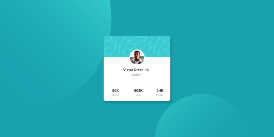
I will appreciate it if i get suggestions on how to improve on the positioning of the svg on the top left and bottom right corner.
Community feedback
- @gmagnenatPosted about 4 years ago
Hi, good work! A few feedback on your solution to make it closer from the original design.
- Make the box-shadow more subtle and more distant from the card container.
- apply a lighter font-weight for the age
- Add a bit of letter-spacing in the bottom lines ( followers, likes, Photos) to improve readability
For the placement of the SVG I struggled also. At the end I used background images on the body. I changed the size and position with viewport height and width on different media queries. (I don't think that's a perfectly working solution).
1
Please log in to post a comment
Log in with GitHubJoin our Discord community
Join thousands of Frontend Mentor community members taking the challenges, sharing resources, helping each other, and chatting about all things front-end!
Join our Discord
