Design comparison
Solution retrospective
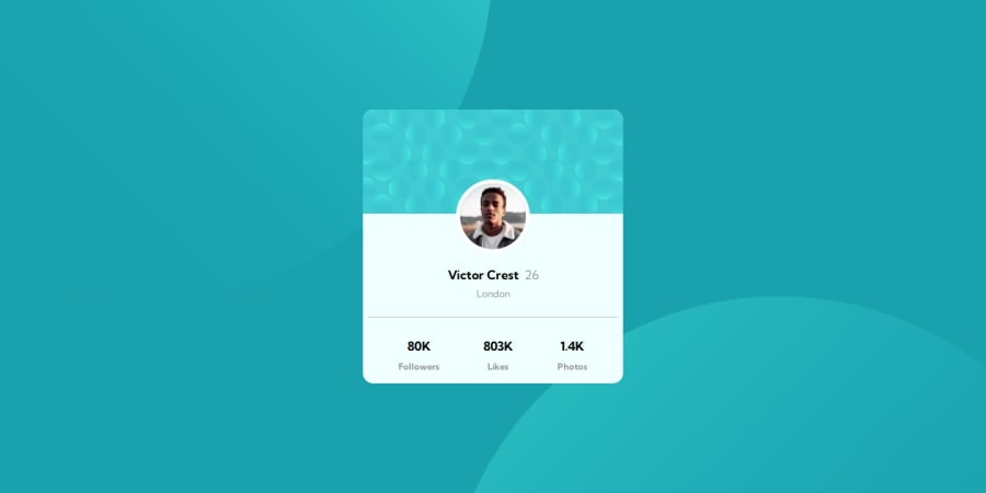
Hello there! I recently completed a project called the Profile Card Component, and I'm eager to gather some feedback. I put a lot of effort into designing and building this project, and I would greatly appreciate any thoughts or suggestions you might have. Did the layout and design of the profile card meet your expectations? Was the user interface intuitive and easy to navigate? Any feedback you can provide would be immensely helpful in improving this project. Thank you in advance for taking the time to share your thoughts with me!
Community feedback
- @KaushalSonicPosted 10 months ago
Thanks buddy, after submitting my solution, I had problem with background imaging placement (I used rem units for top, left, bottom, right with position absolute). When I upscale or downscale my browser viewport then my background images got displace. Now I gone through your code, you used viewport units for alignment or placement of images, its so cool it works. thanks again. I like your approach :)
0
Please log in to post a comment
Log in with GitHubJoin our Discord community
Join thousands of Frontend Mentor community members taking the challenges, sharing resources, helping each other, and chatting about all things front-end!
Join our Discord
