Design comparison
SolutionDesign
Solution retrospective
Feedback welcome.
Community feedback
- @vanzasetiaPosted over 2 years ago
Hi there! 👋
Good effort on this challenge! Your solution looks great! 👏
Some feedback from me.
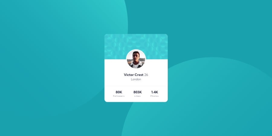
- Alternative text for images should not be hyphenated (like code). It should be human readable and descriptive. Also, it should not contain any words that related to "image". It's an image element already so the screen readers will pronounce it as an image element.
- The
bg-patternis a decorative image so it's best to leave thealtempty to hide it from the screen reader users. This way, those users can focus on listening to the page content. - Use the name of the person as the alternative text for the profile picture.
- I recommend using
ulelement and wrapping each item withlirather than usingdiv. I recommend always writing the HTML markup without any styling (like a document file). This way, you can make a better decision on what HTML element you should use. In this case, if the HTML has no styling then it would make sense to makestatsas a list.- 80K followers
- 803K likes
- 1.4K photos
I hope you find this information beneficial. Happy coding! 😄
Marked as helpful1@abubakr404Posted over 2 years ago@vanzasetia Hello ! Thank you for this awesome advice.
0 - @semi26Posted over 2 years ago
Hello, great job. It really looks identical. It responds well on small devices. I did notice the background change. Overall great work.
1
Please log in to post a comment
Log in with GitHubJoin our Discord community
Join thousands of Frontend Mentor community members taking the challenges, sharing resources, helping each other, and chatting about all things front-end!
Join our Discord
