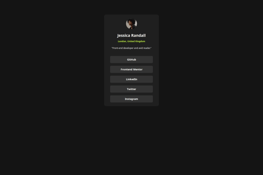
Design comparison
Solution retrospective
I used CSS variables for the first time that I had learned while going through someone else's solution .
What challenges did you encounter, and how did you overcome them?A recurring challenge in making a Front End Mentor challenges is to get margins, gaps, padding exactly as per the images provided. To overcome this, I use my estimation to get as close to images provided to us.
What specific areas of your project would you like help with?Some areas that I would like to helped on is get use/discover various CSS attributes. In this challenge, we had to change the cursor on hover, with the help of goggling I was able find how to target the cursor. If someone can tell me how to learn about other attributes in a fun way I will be eternally grateful.
Community feedback
- @MikDra1Posted about 2 months ago
If you want to make your card responsive with ease you can use this technique:
.card { width: 90%; max-width: 37.5rem; }
On the smaller screens card will be 90% of the parent (here body), but as soon as the card will be 37.5rem (600px) it will lock with this size.
Also to put the card in the center I advise you to use this code snippet:
.container { display: grid; place-items: center; }
Hope you found this comment helpful πππ
Good job and keep going πππ
Marked as helpful1 - @halelitePosted 3 months ago
hi @vknir!
Good job! Your solution looks great!
I just noticed a small thing about your CSS. In the design, the component is centered both horizontally and vertically. I suggest you center your component vertically as well, so your project looks way much better. There are a lot of ways to center it. Some of them are:
-
using flexbox
-
using margin or padding
-
using absolute position property
position: absolute top: 50%; transform: translateY(-50%);
Other that that great job! π
I hope it helps!
Marked as helpful1 -
- @mkborisPosted 3 months ago
Hi vknir nice work, you can learn about different css attributes and on the MDN Web Docs website and also as you build different projects you'll come across different CSS properties.
Here are some suggestions for improvement on your solution
- All content should be wrapped within landmarks. Wrap a
main
tag around the .container - To improve the semantic meaning of these social media links, you should use the
a
(anchor) tag instead of thebutton
tag. Thea
tag is used for navigation to other pages, while thebutton
tag is designed for interactive actions like submitting forms or for events like toggling content. Also, using an unordered listul
to group the social media links is a better approach for both semantics and accessibility. - Avoid setting fixed
heights
andwidths
on elements, as this can create problems with responsiveness and content fit. Instead, let the content andpadding
determine the elementβs size. If necessary, use max-width or min-height, and prefer relative units likerem
for better adaptability. Change thewidth
of the .container tomax-width
and it should be defined inrem
. - Font-size should be written in rem not px. This article explains it better Why font-size must NEVER be in pixels.
- Consider using a modern CSS reset at the start of the styles in every project. Like this one Modern CSS Reset.
Hope this helps
Marked as helpful1 - All content should be wrapped within landmarks. Wrap a
Please log in to post a comment
Log in with GitHubJoin our Discord community
Join thousands of Frontend Mentor community members taking the challenges, sharing resources, helping each other, and chatting about all things front-end!
Join our Discord