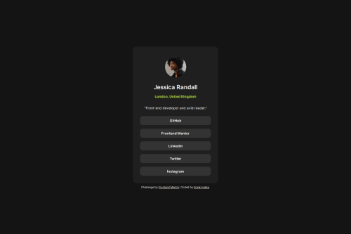
Profile link page with smoothly transitioning active states

Solution retrospective
I used the clamp() function to scale the padding in the card section and it ended up working well. The padding is about 5 % of the element width, but no less than 20 px or more than 30 px.
Another part I'm proud of is the transition property in the link buttons. The background and text color transition smoothly to the active states, with the text color transitioning slightly faster.
transition: background-color 500ms linear,
                color 400ms linear;
My biggest challenge was to get the profile picture centered horizontally. I had to test various margins to get it right.
Another difficult part was the card width. I tried to make it scale dynamically, but that didn't look right. In the end I decided to make it just 350 px.
Please log in to post a comment
Log in with GitHubCommunity feedback
No feedback yet. Be the first to give feedback on vIranq HuQ'qa tuq's solution.
Join our Discord community
Join thousands of Frontend Mentor community members taking the challenges, sharing resources, helping each other, and chatting about all things front-end!
Join our Discord