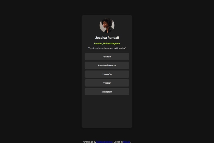
Profile form with social media links and responsive design


Design comparison

Solution retrospective
When reviewing the code, I would say I'm most proud of how the form was styled with clean, modern design elements, making it visually appealing and responsive across different devices. The use of flexbox for centering and layout, along with interactive buttons for social media links, makes the user experience smooth and intuitive.
If I were to do something differently next time, I would consider adding more dynamic features such as error handling, form validation, or even animations to improve the interactivity and polish the user experience further. Additionally, ensuring better accessibility features, like proper aria labels for buttons, would be a great improvement for inclusivity.
What challenges did you encounter, and how did you overcome them?In this code, one of the challenges I encountered was ensuring that the form and buttons were both well-structured and visually appealing while also being functional across different devices. Balancing between responsive design and maintaining an intuitive layout required a bit of fine-tuning, especially when working with flexbox for centering and spacing.
To overcome these challenges, I used flexbox for the layout to easily center and align items, and I adjusted the height and gap values to make sure the content had enough space. I also ensured that the buttons and avatar were sized correctly and responsive by using relative units and keeping accessibility in mind. Testing and iterating on the design helped find the right balance between functionality and aesthetics.
What specific areas of your project would you like help with?For this project, I’d like help with the following areas:
Accessibility Improvements: Ensuring that the form is fully accessible, including adding appropriate aria labels, making the buttons keyboard navigable, and ensuring color contrast is adequate. Form Validation: Adding client-side validation for any form elements (if necessary) or ensuring that user input is correctly handled if we decide to expand the form in the future. Animations: Adding smooth transitions or animations for elements like button hover states or when the form loads to make the user experience more dynamic and polished. Performance Optimization: If the project grows or adds more content, making sure the page loads quickly and doesn't negatively affect performance, especially with assets like images.
Please log in to post a comment
Log in with GitHubCommunity feedback
- @techie084
nice
- @Blackpachamame
📌 Some accessibility and semantics recommendations for your HTML
- To improve the semantics of your HTML, you can change your
<form class="main">to a<main class="main">and the<div class="attribution">to a<footer class="attribution"> - For some reason you have some things that belong in the
headrepeated in yourbody:meta,title - Use
min-heightandmax-width, this will help the content stretch or shrink if you need to. Unlikeheightandwidthwhich can cause your content to be cut off on certain screens. For example, usemin-height: 100vhinstead ofheight: 100vh
- To improve the semantics of your HTML, you can change your


Join our Discord community
Join thousands of Frontend Mentor community members taking the challenges, sharing resources, helping each other, and chatting about all things front-end!
Join our Discord