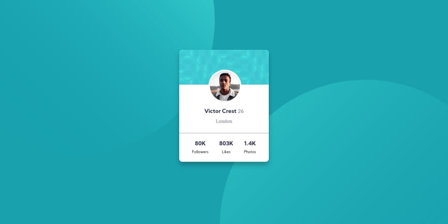
Design comparison
SolutionDesign
Solution retrospective
Please review the design and code. Your feedback will be appreciated.
Looking for any Improvements to be made in my code. Setting those circular graphics at the background, took more time for me. If you have, any alternate methods for designing them, plz suggest.
Thanks :)
Community feedback
Please log in to post a comment
Log in with GitHubJoin our Discord community
Join thousands of Frontend Mentor community members taking the challenges, sharing resources, helping each other, and chatting about all things front-end!
Join our Discord
