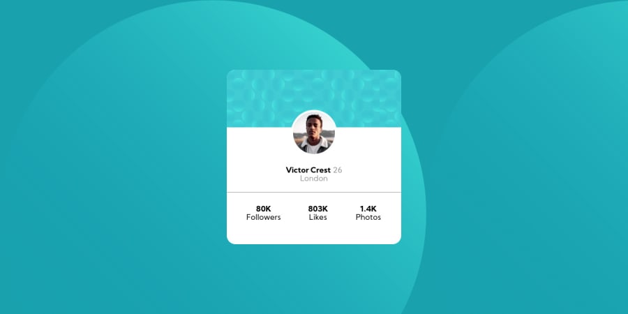
Design comparison
Solution retrospective
Please correct me , im not sure what i have to improve in @media for the responsive part
Community feedback
- @pikapikamartPosted about 4 years ago
may when your at your desired width at media, try to use percentages on the parent so that it will scale. So like when resizing from mobile at dev.tools, your card will scale according to the viewport. Like example, width:90%, so that will only take 90% whatever the size of the viewport^
1 - @herbrasPosted about 4 years ago
Congrats for your Solution.
@media query for background, you can try to add background-position for each query. then add value (top, bottom, right, and left). play this https://developer.mozilla.org/en-US/docs/Web/CSS/background-position
look tricky
Happy coding
0
Please log in to post a comment
Log in with GitHubJoin our Discord community
Join thousands of Frontend Mentor community members taking the challenges, sharing resources, helping each other, and chatting about all things front-end!
Join our Discord
