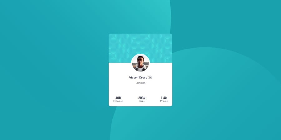
Design comparison
SolutionDesign
Solution retrospective
My biggest question with this challenge was the best way do the background images/design. Could anyone check out my code and see if I did it in the best way, or let me know if there is a better way to achieve the design?
Community feedback
- @danielmrz-devPosted 10 months ago
Hello @scotttabor!
Your solution looks great!
The background pattern with the circles is a bit tricky. Here's how I did it:
š Apply this on the body:
background-color: var(--Dark-cyan); background-image: url("./images/bg-pattern-top.svg"), url("./images/bg-pattern-bottom.svg"); background-repeat: no-repeat, no-repeat; background-position: right 52vw bottom 35vh, left 48vw top 52vh;
I hope it helps!
Other than that, you did an excelent job!
Marked as helpful0@scotttaborPosted 10 months ago@danielmrz-dev Thanks for the tips, Daniel! Ill apply this to the body and see how it changes the behavior.
1
Please log in to post a comment
Log in with GitHubJoin our Discord community
Join thousands of Frontend Mentor community members taking the challenges, sharing resources, helping each other, and chatting about all things front-end!
Join our Discord