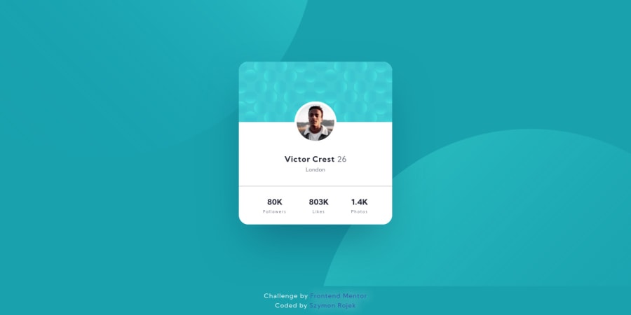
Design comparison
Solution retrospective
Hi. Please let me know if you have any suggestions - CR.
- It was a bit tricky to get the best position of the circles svg as a background, maybe is there a better way to do it?
For this challenge I did:
- HTML semantic elements;
- Invisible content just for Screen Reader users;
- BEM naming;
- Pseudo-elements for background images and border;
- SASS;
- optimal layout for the site depending on device's screen size;
Thanks! :D
Community feedback
- @ApplePieGiraffePosted about 4 years ago
Hey, there, Szymon Rojek! 👋
Nice work on this challenge! 👏 The background SVG circles are definitely tricky to place in this challenge, but I think you've a rather good job on them! 👍
Like, karimseh mentioned, using pseudo-elements is a good way to add the SVGs to the page. You can also add them as CSS background images and use viewport units to position them so that they remain in their place even when the screen is resized. 😉
Keep coding (and happy coding, too)! 😁
1@SzymonRojekPosted about 4 years agoHey @ApplePieGiraffe,
Thank you so much for your feedback. I really appreciate it. I will check bc-image definitely in another solution with the vport.
Have a nice coding too! :D
0 - @karimsehPosted about 4 years ago
Hi Szymon,
I really liked your solution, very clean code, Circles, were also tricky for me, pseudo elements are a great implementation I think, however, I managed to solve it in another way.. don't hesitate to check my solution.
Happy Coding!
Karim
0@SzymonRojekPosted about 4 years agoHi @karimseh
Karim, thank you so much for your feedback. I will check your solution definitely.
Happy <coding> too! :D
0
Please log in to post a comment
Log in with GitHubJoin our Discord community
Join thousands of Frontend Mentor community members taking the challenges, sharing resources, helping each other, and chatting about all things front-end!
Join our Discord
