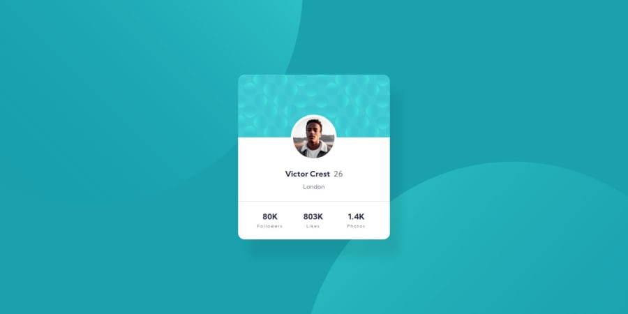
Design comparison
Solution retrospective
This was pretty easy to develop, I did not use grid or flexbox, even though I know how to use it. I just want to track my progress and learn with FrontEndMentor. If you have something to say about this project, please, feel free to say it, I would love to hear your feedback 🚀🚀
Community feedback
- @rnguecoPosted over 3 years ago
Hey Inan! This was an interesting approach!
I still think using Flexbox or Grid is better for this project, so you don't have to explicitly set a width and height for your container. Viewing this on a big screen (> 1440px), all the whitespace surrounding your
contentcard starts to be visible. On a medium screen (~ 600px), it would be nice if all the content fits within the screen and there's no extra space to the right or to the left.Other than that, the details inside
all-footerwould be better off inside a list element like<ul>or<ol>just to be a bit more semantic with your HTML.Cheers and happy coding!
Marked as helpful1@inanbruneliPosted over 3 years ago@rngueco Hey. You are right, I need to use flexbox anyway. I also did'nt know about the responsive, I just create for the width in the design. Thank you very much for the feedback, I am going to do the changes (:
0 - @palgrammingPosted over 3 years ago
you need to put your page background color and background images on the BODY on on your content card so the background can extend the whole browser width and height without effecting your card
Marked as helpful1@inanbruneliPosted over 3 years ago@palgramming Hep, I do not make to be responsive, but I will. Thanks for the feedback!!
0
Please log in to post a comment
Log in with GitHubJoin our Discord community
Join thousands of Frontend Mentor community members taking the challenges, sharing resources, helping each other, and chatting about all things front-end!
Join our Discord
