Design comparison
Solution retrospective
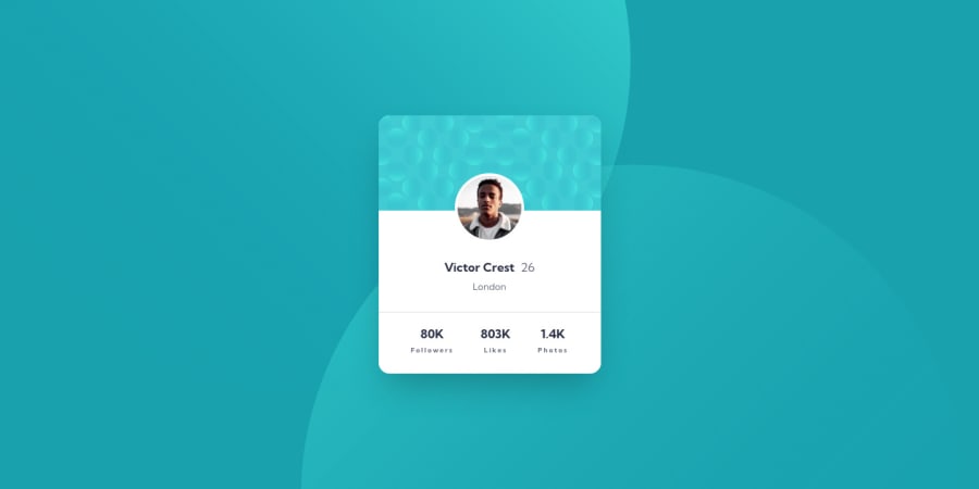
These abstract backgrounds for component challenges are my new Least Favourite Thing Ever.
I can't figure out how they're supposed to behave responsively and I can't even seem to get them positioned absolutely to match the different device designs.
Partly I consider them window-dressing for a component that lacks a real context (and therefore unimportant), but I still spend too much time compulsively messing around with magic numbers trying to get a visual match.
If you're happy with your background for this challenge, or have seen it done well, please send me a link to the solution!
Community feedback
- @BenConfigPosted over 3 years ago
Have you tried experimenting with viewport units to position those background circles?
The right edge of the top circle is about 50vw from the right edge of the screen, and the left edge of the bottom circle about 50vw from the left edge of the screen. This is true for mobile and desktop so you shouldn't need to use any media queries.
You could do something like this:
background: url("images/bg-pattern-top.svg") bottom 50vh right 50vw / auto no-repeat,
            url("images/bg-pattern-bottom.svg") top 50vh left 50vw / auto no-repeat,
            var(--clr-cyan);
Getting the Y axis correct is a little more tricky but I just went with 50vh to keep it simple and it still looks quite accurate to the design.
Marked as helpful0@markup-mitchellPosted over 3 years ago@BenConfig you know, i don't think i have... i tend to avoid viewport units except for very specific situations, bit i guess this might be one of them!
0 - P@kens-visualsPosted over 3 years ago
Hey @markup-mitchell 👋🏻
What a coincidence, today I reopened the project for the same issue 😃 After using
backgroundproperty here and there in different project I've realized how powerful it is. After spending like 30 minutes today, I finally was able to position them as close to the design as possible, and they're also responsive, thanks tomedia queries. Here is the link to my solution, feel free to check it out.I hope this was helpful 👨🏻💻 let me know if you have any questions. Cheers 👾
Marked as helpful0 - @markup-mitchellPosted over 3 years ago
lol, i tried with
backgroundtoo, and it was even worse!Maybe you've got a better approach - I'll check it out, thanks. 👍
1
Please log in to post a comment
Log in with GitHubJoin our Discord community
Join thousands of Frontend Mentor community members taking the challenges, sharing resources, helping each other, and chatting about all things front-end!
Join our Discord
