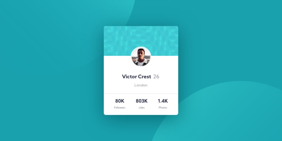
Design comparison
Solution retrospective
Hi, everyone! I'm new to web dev. This is my first challenge on frontendmentor.io, and since I'm a bit rusty on CSS I'm sure it could use some improvements. What I struggled the most with was the background - when I resize the page, the background images move around and I don't know how to fix it. Feedback and advice are welcome. Thanks!
Community feedback
- @grace-snowPosted almost 4 years ago
Hi Ana,
Well done on your first challenge! This looks pretty close to the original design on mobile portrait but doesn't quite work on landscape. Not a big problem, but I can give you some pointers that should help ☺
HTML:
- alt attribute values should be left empty for meaningless or decorative images, like the bg pattern. That let's assistive tech know to not read it out.
- alt text on the profile image needs to be meaningful - probably Victor's name would be best
- it's important to never skip heading levels like h1 > h3. They provide meaning and structure of a document to search engines and assistive tech.
- That said, looking at this content it should only have one heading imo. The name works as a heading, the small amount of content after that all belongs to Victor.
- With the stats in particular, each pair needs to be inside one meaningful html tag - a paragraph or list item. Think about what makes sense as a heading. "80k" would not make sense as a heading, for example. Instead, I would wrap the number and word in one paragraph, then use classes on spans inside that tag to style the number and word differently.
CSS:
- the biggest issue here is using transforms to place everything. If you removed those and used a technique like flexbox it would fix your landscape mobile issue and overall have much more predictable results.
- best practice in css is to keep specificity low by using single class selectors, not ids
- try to use responsive units instead of pixel values where possible, especially for font sizes. That will really help people who need to zoom or adjust default text sizes.
- Next time, try doing mobile first and placing your larger screen styles inside a min-width media query instead. This usually leads to shorter cleaner code in bigger projects.
General:
- there's no need to remove all the design files, readme, style guide etc. In fact, I find it's nice to be able to reference them in the repo. Your choi e though. By all means update the readme with stuff you've learned or whatever, but I always think people should add a link back to the frontend mentor challenge.
- add a gitignore to repos and include ds store in there
I hope all this is helpful for you, keep going with these projects you're well on your way!
2@grace-snowPosted almost 4 years agoIn response to your background image placement question, maybe have a look at my solution for this and see if it helps.
0@RitikBiruaPosted almost 4 years ago@grace-snow Please review my work and correct me.Here is the link for the same "https://www.frontendmentor.io/solutions/htmlcss-edited-with-notepad-YlU-Edc5a#feedback".
0@anaharriPosted almost 4 years ago@grace-snow wow, thank you so much for such detailed feedback! I'll look into it today and include some of your corrections.
0 - @mabarrazaPosted almost 4 years ago
what i did was use the property: absolute which takes the element out of the page flow so no matter what you put the image wont be touched btw how did you managed to find the exact color and font? did you just try until you found it or...
0@grace-snowPosted almost 4 years ago@mabarraza there is a style guide that comes with the download that lists all the colors, fonts and base font size. Have a look for style-guide.md. It's right there in your repo
0@anaharriPosted almost 4 years ago@mabarraza I tried a couple of different ways, and honestly, I don't remember which one I ended up choosing :P but I'll check my code and try that out! Thanks. About the colors and fonts, as @grace-snow said, there's a style guide in the initial folder that you download from the site. Thanks you for your comment!
0@mabarrazaPosted almost 4 years agoohh i'm using the free version :P so i dont have access to those , anyways here's the repository link in case you wanna give it a look(the font, colors and all the specs as said were done by eye so it looks a little bit rusty but i think is good enough), it only has an html file because i used inline css (no particular reason for that).
link: https://github.com/mabarraza/Profile-card-component
0@grace-snowPosted almost 4 years ago@mabarraza free accounts have the style guide.md file so no need to guess the colors and fonts ☺
It's just the sketch/figma files you don't get on the free tier.
I've had a look at your repo and would give you some feedback too but please submit your solution on the frontend mentor website first
0@mabarrazaPosted almost 4 years ago@grace-snow you are right!!! didn't noticed it, and will do it , thx!
0
Please log in to post a comment
Log in with GitHubJoin our Discord community
Join thousands of Frontend Mentor community members taking the challenges, sharing resources, helping each other, and chatting about all things front-end!
Join our Discord