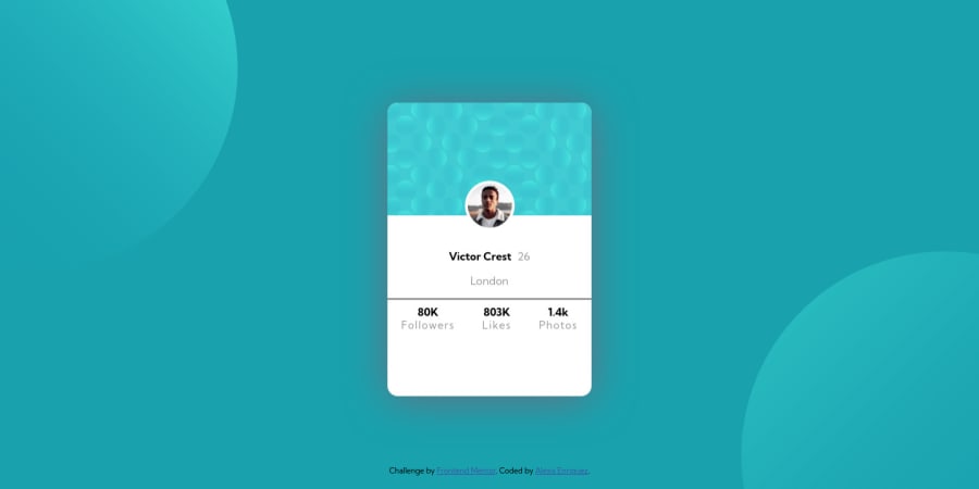
Design comparison
SolutionDesign
Solution retrospective
Feedback appreciated
Community feedback
- @darryncodesPosted about 3 years ago
Hi Alexis,
Great effort, almost an exact match!
- you should add
background-repeat: no-repeat;to your<header>it seems to be repeating on larger viewports - generally working with fixed heights should be avoided, it messes up a great design on some devices. Remove
height: 60vh;from your#cardstyles. Then add somepadding: 20px;to your.statsclass
Happy coding 🤙
1 - you should add
- @FahimMahmudJoyPosted about 3 years ago
Hi Alexis, You may want to make the card look a bit more square in the large screen. On small screen, it looks fine.
0
Please log in to post a comment
Log in with GitHubJoin our Discord community
Join thousands of Frontend Mentor community members taking the challenges, sharing resources, helping each other, and chatting about all things front-end!
Join our Discord
