Design comparison
Solution retrospective
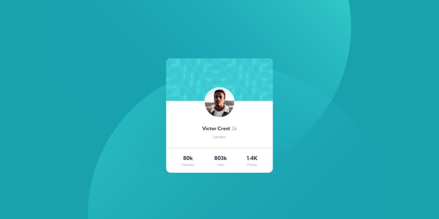
Working on this task was quite stressful, placing the background-image was really hard to align but i just some help on YouTube. Your Constructive Criticism is required. Thank you
Community feedback
- @correlucasPosted about 2 years ago
👾Hello Busoalmi, Congratulations on completing this challenge!
Your solution its already good, something you can do to improve the card responsiveness is create a media query for the
stats sectionand make each stat number stay in a different row aftermax-width: 350pxusing a media query, here's the code for that:@media (max-width: 350px) { .profile-review { margin-top: 30px; display: flex; align-items: center; justify-content: space-between; padding: 20px 50px; border-top: 0.1px solid #cfc8c8; flex-direction: column; } }✌️ I hope this helps you and happy coding!
Marked as helpful0 - @vanzasetiaPosted about 2 years ago
Hi, Busoalmi! 👋
Congratulations on finishing this challenge! 👏
The background images are indeed the most challenging part of this challenge. For your reference, I recommend taking a look at Grace's solution on how to handle those circles. The way she handled the background images is easy to understand.
One suggestion I have is to use a list instead of a
divfor theprofile-review. Also, the statistic numbers are not headings. It makes more sense if the content is a list.- 80k followers
- 803k likes
- 1.4k photos
That's it! I hope this helps! 🙂
Marked as helpful0 - @SOULBRODA023Posted about 2 years ago
Wow this is pretty good, even though I am new here... when I am about doing mine. I will make sure I do it well with all the helpful corrections here.
0
Please log in to post a comment
Log in with GitHubJoin our Discord community
Join thousands of Frontend Mentor community members taking the challenges, sharing resources, helping each other, and chatting about all things front-end!
Join our Discord
