

Design comparison
SolutionDesign

Solution retrospective
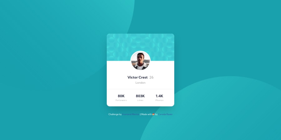
Question for Community: Do the challenge design's location and statistics labels (not the numbers) seem bolder than the 400 font-weight listed in the style guide? I feel like that value actually only applied to the age.
Feedback Request: I would love your feedback on the following areas of my code:
- 📐 positioning the background elements
- 📦 use of margins/padding to control spacing within the layout
I tried to get as close as possible to the actual design based on the design file dimensions (desktop: 1440 x 667, mobile: 375 x 667), which created a need for more control through margins/padding. If there are smarter or cleaner ways to accomplish this, please do share!
Community feedback
Please log in to post a comment
Log in with GitHubJoin our Discord community
Join thousands of Frontend Mentor community members taking the challenges, sharing resources, helping each other, and chatting about all things front-end!
Join our Discord