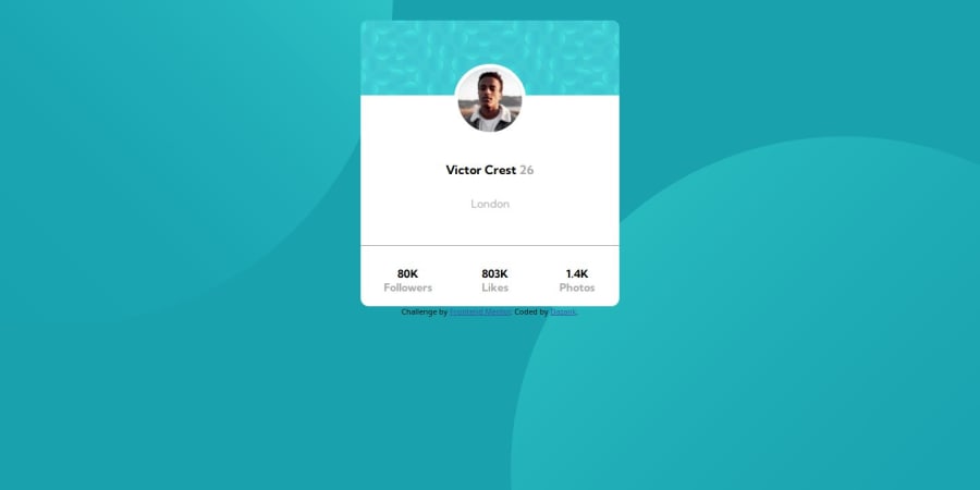
Design comparison
Solution retrospective
I would appreciate it if you could provide feedback on my code, anything that can help me improve is appreciated. Anything on semantics in particular would be of great help.
Community feedback
- @danielmrz-devPosted 9 months ago
Hello @Dazank!
Your solution looks great!
The background pattern with the circles is a bit tricky, but you don't need separate containers to create it as it's possible to work with multiple background images at the same time. Here's how you can do it:
📌 Add this to the body:
  background-color: var(--Dark-cyan);
  background-image: url("./images/bg-pattern-top.svg"), url("./images/bg-pattern-bottom.svg");
  background-repeat: no-repeat, no-repeat;
  background-position: right 52vw bottom 35vh, left 48vw top 52vh;
I hope it helps!
Other than that, you did an excelent job!
Marked as helpful0@DazankPosted 9 months ago@danielmrz-dev Thank you for the feedback, it helped me understand how to get the same result with less code.
1
Please log in to post a comment
Log in with GitHubJoin our Discord community
Join thousands of Frontend Mentor community members taking the challenges, sharing resources, helping each other, and chatting about all things front-end!
Join our Discord
