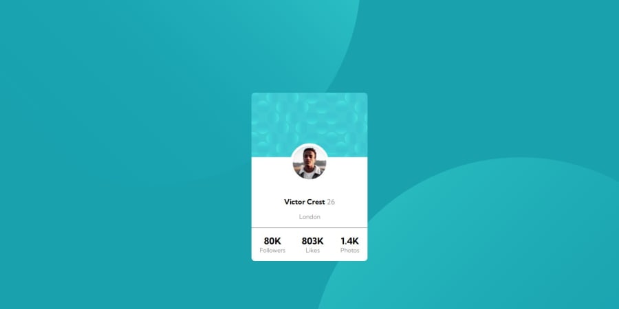
Design comparison
SolutionDesign
Solution retrospective
I face many difficulties on this project review the code , and submit my wrong.
Community feedback
- P@danielmrz-devPosted about 1 year ago
Hello @ad-monir2001!
Your solution looks great!
The background pattern with the circles is a bit tricky, but you don't need separate containers to create it as it's possible to work with multiple background images at the same time. Here's how you can do it:
📌 Add this to the body:
  background-color: var(--Dark-cyan);
  background-image: url("./images/bg-pattern-top.svg"), url("./images/bg-pattern-bottom.svg");
  background-repeat: no-repeat, no-repeat;
  background-position: right 52vw bottom 35vh, left 48vw top 52vh;
I hope it helps!
Other than that, you did an excelent job!
Marked as helpful0
Please log in to post a comment
Log in with GitHubJoin our Discord community
Join thousands of Frontend Mentor community members taking the challenges, sharing resources, helping each other, and chatting about all things front-end!
Join our Discord
