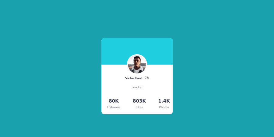
Design comparison
SolutionDesign
Solution retrospective
I'm still getting into making art with css
so I didn't implement the background circles, I was wondering how one would start getting in doing css art, cause right now the most I know about is flex and grid lmao.....
Community feedback
- @vanzasetiaPosted over 3 years ago
👋Hi TiredQuan! My name is Vanza!
Does css art means svg? I think it's okay to use those svg as
background-image
. Anyway, I have some feedback that will improve this solution:- Try to use consistent indentation on your
css
andhtml
, so they can be easily be read. - Let's take a look on this chunk of your css:
[class*="card-profile"] { padding: 0 0 0 0; margin: 0 0 0 0; }
- You can get the same effect by just writing this:
[class*="card-profile"] { padding: 0; margin: 0; }
- On mobile screen size (below 400px width), try to add
padding-right
andpadding-left
on yourbody
to prevent the card touching the corner screen.
That's it! Hopefully this is helpful!
Happy Coding and Keep on Learning!
Marked as helpful1 - Try to use consistent indentation on your
Please log in to post a comment
Log in with GitHubJoin our Discord community
Join thousands of Frontend Mentor community members taking the challenges, sharing resources, helping each other, and chatting about all things front-end!
Join our Discord