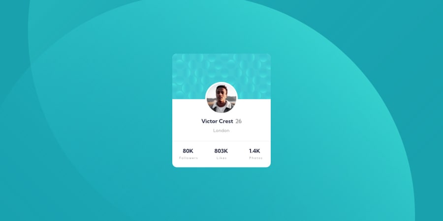
Design comparison
Solution retrospective
Profile Card Solution
Fun one. I remember this was the first one I tried to do when I first joined in May of this year, and I could not do it with what I knew and although right now my code is super messy, the fact that I could make it look even just 70% of the design file is something I am really, really and truly happy about.
In this one I got to play a bit with the position
property, as I recently realised I don't know it well at all, I used the border-box property to put boxes around things when I was using it for what I used it for in this solution, its not perfect, its hacky, but it was the only way I could think to make the look work. I will learn more and refactor this file as I learn.
All in all fun; and if anyone has any tips/tricks and advice I would be happy for it. <3 ty for reading and have a good day.
Community feedback
- Account deleted
You can add
object-fit: cover
if you don't want the card pattern to get squeezed on smaller screens. And you can usebox-shadow
to give the card a shadow.For user statistics it's betters to use
<ul>
(unordered list), make stats<li>
(list items) and use the<span>
element to style parts of text. And the card should be an<article>
or a<section>
element instead of just a div to give the HTML more meaning. For the background image you can use a media query so it looks good on desktop too.Instead of
px
it's better to userem
. Rem means root em which is the default font size. Most browsers have a font size of 16px by default. You could change that to 10px by setting font-size to62.5%
on the html element in CSS. That way 1rem will be equal to 10px which is more convenient for you and the people with vision problems who need bigger text. If they change the browser's default font size to something bigger everything that uses rem will become bigger whereas if you use px everything will stay the same size. Watch this video.Marked as helpful1@ofthewildfirePosted over 2 years ago@zauri-khutsishvili ty. I will refactor this as soon as I can. :) and I am currently doing a series of tutorials on responsive and have learned about rem, its still a bit hard for me to use, but in my current challenge i am using it exclusively as you recommend. <3
0 - @0xabdulkhaliqPosted over 1 year ago
Hello there 👋. Congratulations on successfully completing the challenge! 🎉
- I have other recommendations regarding your code that I believe will be of great interest to you.
BACKGROUND iMAGE 📸:
- Looks like the background images has not been properly set yet, they are drastically misplaced.
- So let me share my css snippet which helps you to easily apply the
background color
with thebackground svg
they provided to place perfectly as same as design.
- Add the following style rule to your css, after completing these steps you can experience the changes.
body { background: url(./images/bg-pattern-top.svg), url(./images/bg-pattern-bottom.svg); background-position: right 52vw bottom 35vh, left 48vw top 52vh; background-repeat: no-repeat, no-repeat; background-color: hsl(185deg, 75%, 39%); }
- Tip, Don't forget to generate a new screenshot after editing the
css
file
.
I hope you find this helpful 😄 Above all, the solution you submitted is great !
Happy coding!
Marked as helpful0
Please log in to post a comment
Log in with GitHubJoin our Discord community
Join thousands of Frontend Mentor community members taking the challenges, sharing resources, helping each other, and chatting about all things front-end!
Join our Discord