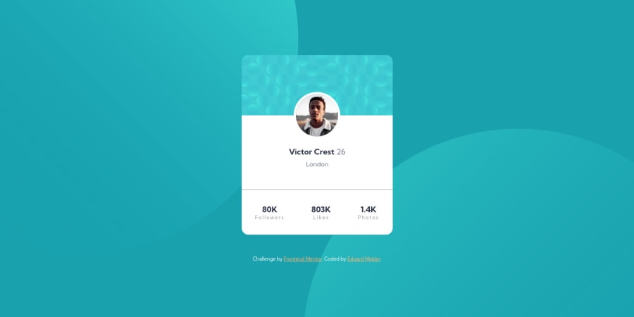


Design comparison

Solution retrospective
Any suggestions for making the background more fluid responsive? I feel like background-position percentages didn't work like I expected they would, so I just had to make manual breakpoints which didn't feel very elegant.
Community feedback
- @pikapikamartPosted over 3 years ago
Hey, great work on this one. Layout seems fine in desktop and mobile state as well.
Regarding you question:
- Well for this one, have you tried to use
%as the size of those circle images? Using%as their units makes it responsive. You can use it on thebackground-sizeproperty. I haven't tried that exact unit, but you can tinker until you find the desired size. Also, it could have also usedclampfunction. This function is really really really good for creating responsive sizes, if you want to learn it, well google is one browser away :>
Some suggestions would be:
- Adding some
paddingto the top of thebodytag just to prevent the layout from touching the ceiling of the screen. - On the image that you used on the card, you could have set the
altattribute to be empty likealt="". One good rule of thumb, when you think an image svgs or any other graphics on a webpage, if that graphic doesn't really adds any information or adds to the context, or when it is just for purely decorative purpose, you should set theiraltto be empty. - The name of the person along with the age could have been wrapped in a heading tag like
h1orh2. - Those information below the person, the followers, likes, photos. They are list of information right? That is why using
ulelement is really good for those. So those three information will be really good inside their ownlitag inside theul.
Other than those, you did a good job on this one. Also, if you have any question, just drop it here okay.
Marked as helpful0@emekler0729Posted over 3 years ago@pikamart Thanks for the feedback! I played around with this a bit more and ended up decided to leave it the same.
clampworks great.background-sizeworks great.background-positionis whack. Because of the way background position is calculated, a negative%can result in a right offset or left offset of the background image depending on the image size and container size... not sure who decided this would be the optimal spec, but it doesn't make responsive positioning very simple.0 - Well for this one, have you tried to use

Please log in to post a comment
Log in with GitHub
Join our Discord community
Join thousands of Frontend Mentor community members taking the challenges, sharing resources, helping each other, and chatting about all things front-end!
Join our Discord