Design comparison
SolutionDesign
Solution retrospective
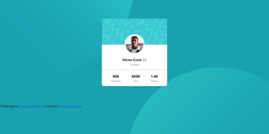
My third challenge. Any suggestion is welcome. Thanks.
Community feedback
- @waltersonoPosted almost 4 years ago
Hi Jugo-JS
The design looks good, just some suggestions to make your code better in the next projects:
-
Do not use images tags for background images
- Images tags are used to insert content relatable images
- Images inserted using images tags interrupt other resources
- Use
divsinstead, and apply a background images
-
Add alternative text the image of the profile photo
- Alternative text are used by screen readers to inform a user that cannot see the image what is the image is about, or even when the user as slow internet and the image cannot be downloaded
Ok Jugo-JS, hope this is helpful.
Keep on coding!
Marked as helpful0 -
Please log in to post a comment
Log in with GitHubJoin our Discord community
Join thousands of Frontend Mentor community members taking the challenges, sharing resources, helping each other, and chatting about all things front-end!
Join our Discord
