Design comparison
SolutionDesign
Solution retrospective
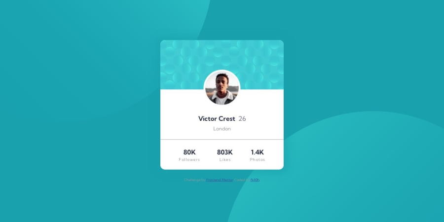
My question are about the avatar image and the background SVG's.
NOTE: I didn't use any figma files, i've only use the given assets.
- I have use margin to adjust the avatar image inside my card container, I would love to know any other possibility that may be best to fit the desired design.
- I struggle a lot regardless the background before finding something "good", so any feedback for this are really welcome.
Community feedback
Please log in to post a comment
Log in with GitHubJoin our Discord community
Join thousands of Frontend Mentor community members taking the challenges, sharing resources, helping each other, and chatting about all things front-end!
Join our Discord
