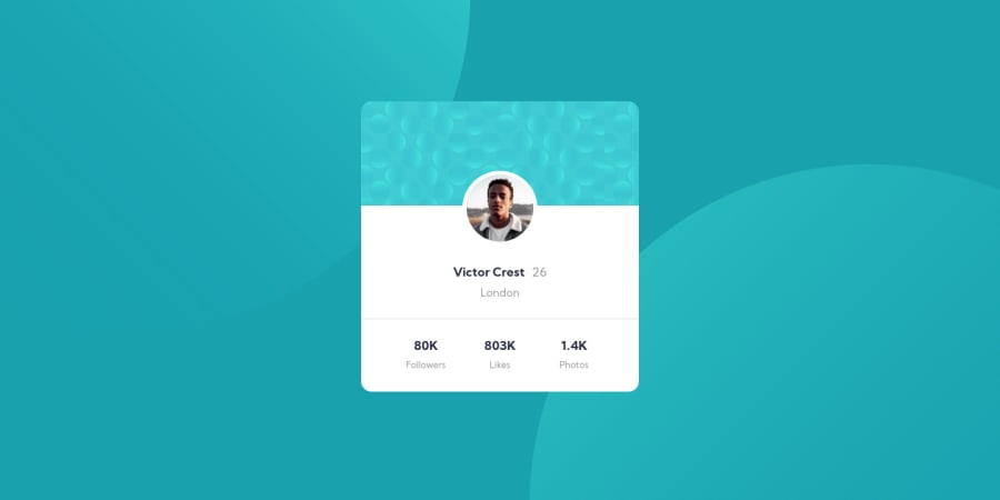
Design comparison
SolutionDesign
Solution retrospective
It gets better with each challenge. I am thankful for this community. This is my submission folks! Corrections are very welcome. Thanks ✌🏽
Community feedback
- @trafikiPosted over 3 years ago
Thanks for the feedback @vanzasetia. Where would you suggest I use headings, ul, and li in this case. I get confused about this sometimes except for situations where it's quite obvious like an actual list or page heading.
Edit: Never mind, I took a look at your solution and now have a clue. Thanks
0 - @vanzasetiaPosted over 3 years ago
👋Hi Akerele Tunde! My name is Vanza!
I have some feedback that may improve this solution:
- For the
bg-pattern-top.svgandbg-pattern-bottom.svg, I recommend to set them as abackground-imagelike this, since it is a bg:
background-image: "./images/bg-pattern-top.svg", "./images/bg-pattern-bottom.svg"; background-repeat: no-repeat;- Then you can try position them using
background-position. - Also when the user phone is landscape (640 * 360), the card will be touching the top and the bottom screen. Try to add
paddingto prevent it. - Try to use
headingstag,ul,li, instead of justdivandspan.
That's it! Hopefully this is helpful!
0 - For the
Please log in to post a comment
Log in with GitHubJoin our Discord community
Join thousands of Frontend Mentor community members taking the challenges, sharing resources, helping each other, and chatting about all things front-end!
Join our Discord
