Design comparison
SolutionDesign
Solution retrospective
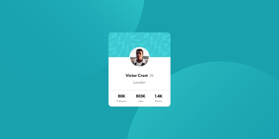
Hello, Here's my solution for the Profile Card Component, using Tailwind CSS.
I had difficulties with those parts:
- Border width around the profile picture: I applied border radius and width directly to the image and not to the parent div of the profile picture because it did not work. I am still trying to find the cause, and other alternatives (ring...).
- The body background .svg files position: it was very hard to adjust the position of the top and bottom pattern for the background. I spent more time on this part than on the whole profile card.
Thank you
Community feedback
- @luisgcodePosted about 2 years ago
Hello There Wilou, You can fix the accessibility issue you have just adding a role to the main container, for example:
<div class="flex justify-center items-center h-screen" role="mainContainer">good job and good luck!
0
Please log in to post a comment
Log in with GitHubJoin our Discord community
Join thousands of Frontend Mentor community members taking the challenges, sharing resources, helping each other, and chatting about all things front-end!
Join our Discord
