Design comparison
Solution retrospective
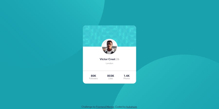
-I positioned the profile photo of Victor using <strong>negative margin </strong>, is there any better method to do it? -on screens <strong> >1440px of width </strong> the <strong>background circles does not resize </strong>, I wonder whether there is a solution to scale them consistent to the size of a larger viewport, so there is no difference along all the widths. I will be very grateful for any suggestions & comments. Wish you all a happy day spent on coding 😀
Community feedback
- @rrgmonPosted over 3 years ago
Hmm I don't know if mine is 100% correct. But I used position: absolute on Victor's image, and moved it around with top/left/right/bottom commands. And tried to center it with transform: translate(). Just play around with the values and see what helps!
0
Please log in to post a comment
Log in with GitHubJoin our Discord community
Join thousands of Frontend Mentor community members taking the challenges, sharing resources, helping each other, and chatting about all things front-end!
Join our Discord
