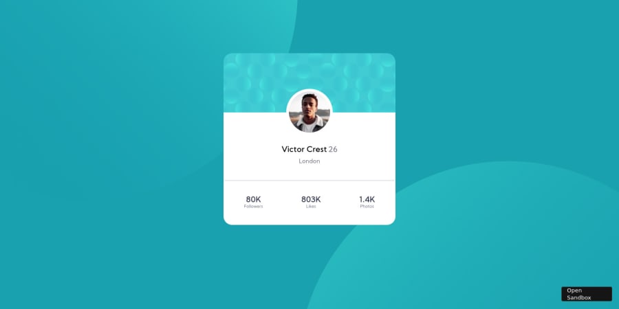
Profile card component using just html and css.
Design comparison
Solution retrospective
I would appreciate if someone could give feedback on how to improve this challenge, specially on the mobile responsive part, which I couldn´t quite do correctly xD, and at any rate I hope you like the code and such!.
Community feedback
- @tin-phamPosted over 3 years ago
I think you should set the min-width for the container, when I minimize the window to mobile layout, it shrink too much
1@MichaelArayaMurciaPosted over 3 years ago@phambaohuy12345 sure do!, thanks for leaving feedback! :D.
1@tin-phamPosted over 3 years ago@MichaelArayaMurcia No problem, can you visit my submit ^ ^, i just have done this project too, you can find that on the top of solution summited
0 - @tin-phamPosted over 3 years ago
Can i ask you one question, is it worth it to buy pro member of frontendmentor
0@MichaelArayaMurciaPosted over 3 years ago@phambaohuy12345 Well I have only recently started with this challenges but I would say that it is worth it for 2 reasons, the figma and the original design files which help alot and also because since you spend the money that keeps you motivated to continue with the challenges, one example would be how 19000+ people started this challenge but only around 3 have completed it, but at the end of the day is your choice and it is not mandatory by any means as long as you have fun and keep learning :D.
1
Please log in to post a comment
Log in with GitHubJoin our Discord community
Join thousands of Frontend Mentor community members taking the challenges, sharing resources, helping each other, and chatting about all things front-end!
Join our Discord