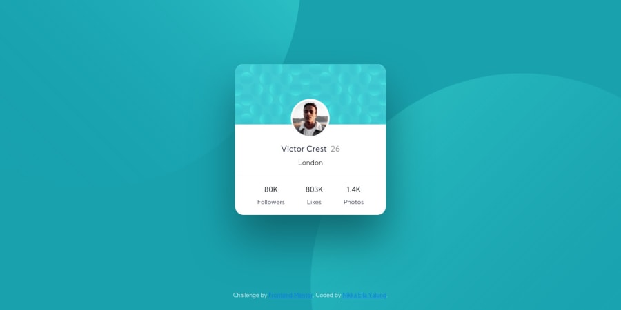


Design comparison

Solution retrospective
Hi,
I'd like some feedback on how to keep the main profile area in the middle of the screen, regardless of size. It's currently hard-coded for mobile and web, so if a mobile user with an iPhone X looked at it, it'd be off-center.
I would also like some more feedback on improvements I can make.
EDIT: I made some improvements with the help of the comments, and it looks much better now! I learned Bootstrap and it made everything so much easier. I tried to use less absolute positioning, but they're still used for the profile photo :/ . Any constructive criticism is still welcome!
Community feedback
- @phonzdevPosted almost 4 years ago
Hi Nikka! I hope you're doing well! Here are my suggestions after reviewing your code:
-It is considered best practice to separate structuring the content (HTML) with presentation (CSS). This means that the two background patterns (which are covered by presentation) would be better if inserted using the
background-imageproperty on your stylesheet.-Learn semantic HTML to make your webpage more meaningful.
-check out and learn BEM
-it's considered best practice to build on mobile design first then move up and adjust your styling using media queries.
Keep up the good work and keep on practicing! Don't forget to upvote comments you find helpful :D stay safe!
2 - @antoineramePosted almost 4 years ago
Hey ! You should use flexbox to center your element, it's the more efficient way. The element parent have to take 100% width of the page and then put these termes in css for the element parent : display: flex; / justify-content: center; (this propriety is to center the element on the width) / align-items: center; (this propriety is to center the element on the height) Don't use absolute position for things like that. You are using it for every element, that's a lot of work for nothing. Learn flexbox to make responsive site more easily. Good luck I think you will have to rewrite your css a lot ! You can check my version of this work on my profile to look to my code. Good luck
1


Please log in to post a comment
Log in with GitHub
Join our Discord community
Join thousands of Frontend Mentor community members taking the challenges, sharing resources, helping each other, and chatting about all things front-end!
Join our Discord