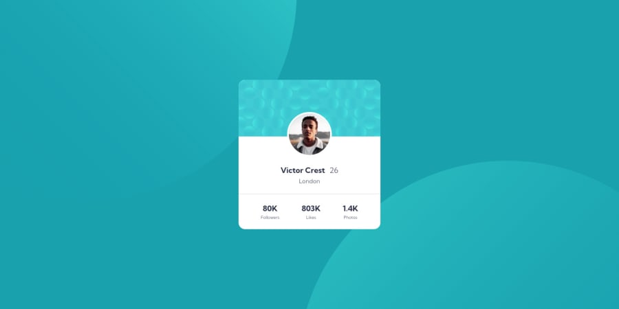
Design comparison
Solution retrospective
Hi all,
Kindly please let me know if I have any mistake/improvement on this solution. Any comment is welcome as I want to improve my coding skills.
Thank you and Happy Coding!😀
Community feedback
- @nottohavePosted about 3 years ago
Hello @SheldonFam, congratulation on finishing this easy challenge. For feedback, I strongly recommend to build a good README file after you finish your project. That way people know who you are and see what you learnt throughout your days. It builds trust as well. Anyways for the project, it looks really good on my devices. Instead of using div in your html file, try using section on area with heading and paragraph. This is for the semantic html. It will make your code readable. You can also add comments on your css file to explain what the box and box p are. I just want to add more clarity into your code. I hope this feedback helps you. Let me know if that does not. Have a great one.
Marked as helpful0
Please log in to post a comment
Log in with GitHubJoin our Discord community
Join thousands of Frontend Mentor community members taking the challenges, sharing resources, helping each other, and chatting about all things front-end!
Join our Discord
