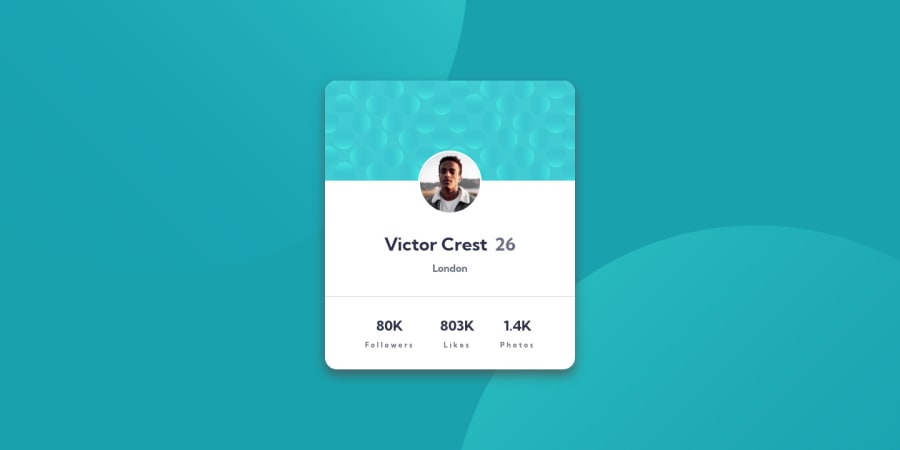
Profile card component using HTML CSS & JavaScript
Design comparison
Solution retrospective
I hope you enjoy my work if you checked something wrong about my design please, feel free to comment with your suggestions.
Community feedback
- @correlucasPosted over 2 years ago
👾Hello Carl, congratulations for your solution!
The design for this challenge is perfect, you did almost everything. There's only two issues with the
.card-section. You've add thebackground-imageinside this tag so when your solution scale downs the cyan background doens't follow its proportions, try to add the background color the body instead.To keep the card responsive is better you use
max-widthand use a value like350pxinstead of100vh. Note that your card ins't contracting when the screen scales.Here's the fixes:
body {
    background: var(--Dark-cyan);
    min-height: 100vh;
}

.card-section {
 /*   min-height: 100vh; */
    max-width: 350px;
}
Hope it helps and happy coding!
Marked as helpful0
Please log in to post a comment
Log in with GitHubJoin our Discord community
Join thousands of Frontend Mentor community members taking the challenges, sharing resources, helping each other, and chatting about all things front-end!
Join our Discord
