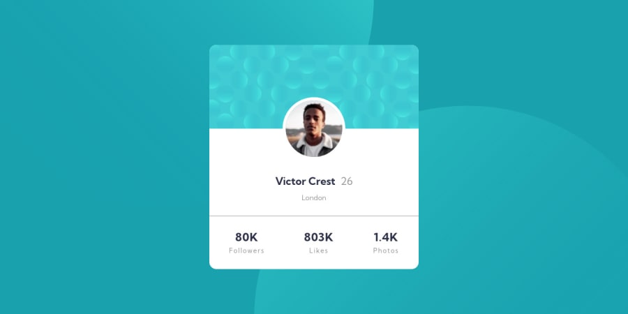


Design comparison
SolutionDesign

Solution retrospective
The first challenge I ran into was the background and how to position the two images. I think I got close using this code:
body {
    background-image: url(./images/bg-pattern-bottom.svg), url(./images/bg-pattern-top.svg);
    background-position: right -7.5rem bottom -31.25rem, left -7.5rem top -31.25rem;
    background-repeat: no-repeat, no-repeat;
    background-size: auto, auto;
Could there have been an easier way?
The other part I struggled a lot with was the positioning of the profile image, but I think I got it right efficiently.
On the mobile design picture, there always seems to be a gap between the browser and the actual card. I have been adding a margin around the card once the browser reaches a certain width. Is this right?
@media screen and (max-width: 500px) {
    body {
        margin: 0 1.25rem;
    }
}
Thanks for the help!
Community feedback
Please log in to post a comment
Log in with GitHub
Join our Discord community
Join thousands of Frontend Mentor community members taking the challenges, sharing resources, helping each other, and chatting about all things front-end!
Join our Discord