Design comparison
Solution retrospective
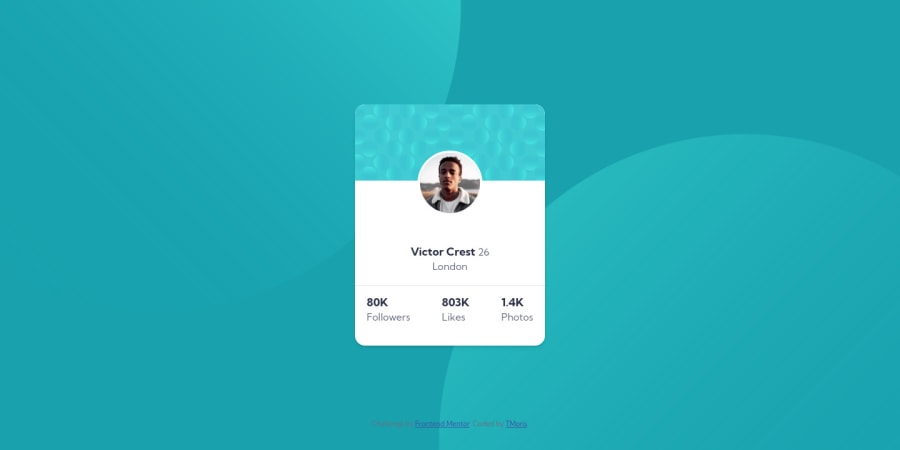
Hi, community. I have completed another challenge and experienced difficulty in handling background image components of the design. I have used pseudo properties to solve it though doubting whether it's the best option. Secondly, the responsiveness of the background images is another issue, but i tried using multiple media queries to fix it. I still feel it isn't the best idea. Any one with more ideas and best options can advise up. Thanks
Community feedback
- @Bayoumi-devPosted over 2 years ago
Hey Moris,
My suggestions:
- An easy way to handle the background
circles
, Give thebody
or the profile card container the following style to put thesecircles
as abackground image
:
body { /* background-color: var(--clr-Darkcyan); */ <--- Remove background: url(../images/bg-pattern-top.svg) right 50vw bottom 40vh no-repeat, url(../images/bg-pattern-bottom.svg) 50vw 50vh no-repeat var(--clr-Darkcyan); //... }
Page should contain a level-one heading
, Changeh2
toh1
<h1 class="name">Victor Crest <span class="text-reg">26 </span></h1>
You should always have one
h1
per page of the document... in this challenge, you will useh1
just to avoid theaccessibility issue
that appears in the challenge report... but don't useh1
on small components<h1>
should represent the main heading for the whole page, and for the best practice use only one<h1>
per page.- I suggest you put the status of the profile card into the
list item
to add moresemantics
to your project,Div
's don't do much for semantics but a list is much more meaningful..:
<ul class="stats"> <li><span class="stats-num">80K</span>Followers</li> <li><span class="stats-num">803K</span>Likes</li> <li><span class="stats-num"> 1.4K</span>Photos</li> </ul>
I hope this is helpful to you... Keep coding👍
Marked as helpful0@tmorisPosted over 2 years ago@Bayoumi-dev, Thanks for saving me up, actually i have been having this accessibility report issue always and background images issue. You advise bails me up now. Very helpful, thanks once again and best regards
0@tmorisPosted over 2 years agoHey, @Bayoumi-dev. I have updated it, and its eye catching i love it. Thanks a lot for helping me out.
0@tmorisPosted over 2 years ago@Bayoumi-dev. I need to kick start challenges which involves JS however, am not well conversant with it now. I will be disturbing you a little for help brother, Thanks
1@usanCodePosted over 2 years ago@Bayoumi-dev Hello,
How are you? You've really provided a very helpful post here. Me too I have issues on how to put the images into their proper places and make them stay there when changing the viewport's width. The other problem is how to put a container right in the middle of the body of the webpage vertically. And something else I would like to know... is how to screenshot or highlight some parts of the code or words ,as you've done in this comment, and paste them here.
0 - An easy way to handle the background
Please log in to post a comment
Log in with GitHubJoin our Discord community
Join thousands of Frontend Mentor community members taking the challenges, sharing resources, helping each other, and chatting about all things front-end!
Join our Discord