Design comparison
Solution retrospective
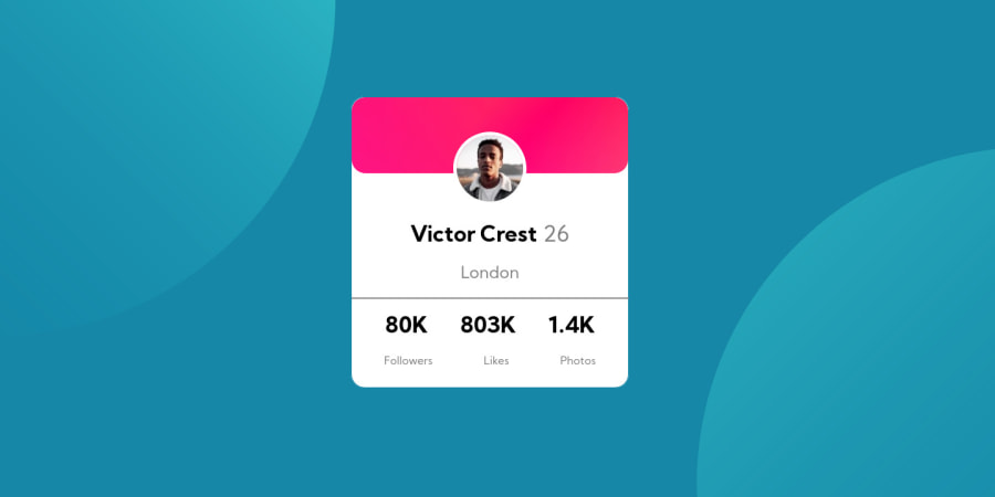
I couldn't manage to add the profile card's background picture, so I used different color. Also I think the profile card isn't at the center of the page. Can you help me?
Community feedback
- @janegcaPosted almost 4 years ago
Hi Ezgl, this article on background images by Ahmad Shadeed might help. Also try Stepahnie Eckles Learn How to Make a Website, she has a video on Semantic HTML (Episode 4) and on Responsive Design (Epidsode 16).
0 - @grace-snowPosted almost 4 years ago
Hi, I think you need to spend a bit more time on this. Use the background image property for that pattern, but there's more than that to look at on this. Try to make every detail of the card look right on a mobile first, that should help give you a good base before worrying about the page background colors and circles
0@grace-snowPosted almost 4 years agoLooking at your html, a lot needs changing as well I'm afraid. It's fine for the name to be a h1, but the rest of the content should be in paragraphs or list items. Read up on semantic html for tips
0 - @gloriellPosted almost 4 years ago
Hi, keep up exercising, I would recommend that you should watch a Flex-Box(or a Grid) tutorial it would really help you center all the stuff.
0
Please log in to post a comment
Log in with GitHubJoin our Discord community
Join thousands of Frontend Mentor community members taking the challenges, sharing resources, helping each other, and chatting about all things front-end!
Join our Discord
