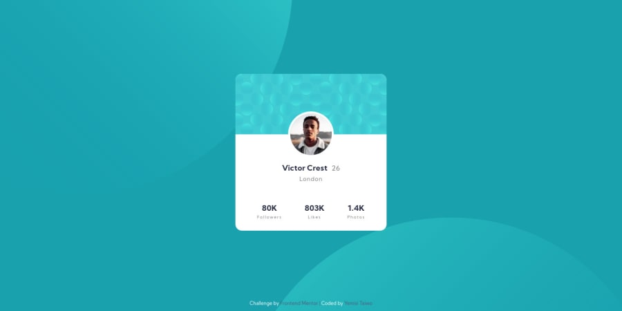
Design comparison
Solution retrospective
Hey guys, feedbacks on this project will be appreciated.
Community feedback
- @shivjoshi1996Posted over 3 years ago
Hey there!
Good job on this challenge!
I noticed that the circle backgrounds were a little funny when resizing the screen. Using viewport units (vh, which is viewport height, and vw, which is viewport width) may be better. For example, if you replace what you currently have for
background-postion, whichbackground-position: right 50vw bottom 40vh, left 50vw top 50vh;it should look a little better.I also noticed that your profile card is not completely centred on the screen - this is because your grid container
containerdoes not include the footer. Moving the footer into thecontainerdiv will centre the card. However, you may need to put a bit ofpadding-topto the footer so that the footer and the card have some space.Cheers! Shiv
1
Please log in to post a comment
Log in with GitHubJoin our Discord community
Join thousands of Frontend Mentor community members taking the challenges, sharing resources, helping each other, and chatting about all things front-end!
Join our Discord
