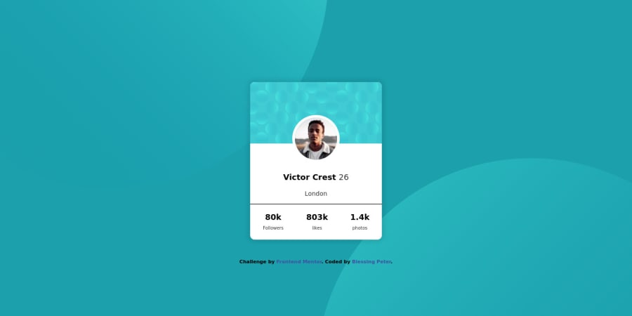
profile card component using html and css
Design comparison
Solution retrospective
i'd really love a feedback
Community feedback
- @artimysPosted over 4 years ago
Nice work Blessing Peter. I'll leave some feedback below. Hope it helps.
- The 2 background images are tricky. An easier solution I highly suggest is using multiple background images. Link here for more info
To improve on your current background solution because they are
position: relativethey are part of the flow of elements and is possible that it makes your content wider than the viewport (browser screen). You can tryposition: fixedand play with positioning usingleft,right,top, andbottom.- The
<font>tag is old and obsolete. Instead use<span>as a replacement. For this tag I would recommend the<small>tag.
Keep on coding!! 👍
0
Please log in to post a comment
Log in with GitHubJoin our Discord community
Join thousands of Frontend Mentor community members taking the challenges, sharing resources, helping each other, and chatting about all things front-end!
Join our Discord
