Not Found
Not Found
Not Found
Not Found
Not Found
Not Found
Not Found
Not Found
Not Found
Not Found
Not Found
Not Found
Not Found
Not Found
Not Found
Not Found
Not Found
Not Found
Not Found
Not Found

Submitted

Profile Card Component using Flexbox

generieyycโ€ข 160

@generieyyc

Desktop design screenshot for the Profile card component coding challenge

This is a solution for...

  • HTML
  • CSS
1newbie
View challenge

Design comparison


SolutionDesign

Solution retrospective


Hello Everyone!

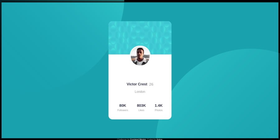
I find the backgrounds challenging. I know there's a better way of doing it in CSS instead of using it as HTML image but it's not working for me. If you have better solutions, I would appreciate it if you'd give me feedback and tips on how to make it better. Thank you!

Community feedback

Finneyโ€ข 3,030

@Finney06

Posted

Hello there ๐Ÿ‘‹. Good job on completing the challenge !

Here are some suggestions regarding your code that may be of interest to you.

HTML ๐Ÿ”ค:

To clear the Accessibility report:

  • Use an h1 tag for the main text in the design given and always avoid skipping heading levels; Starting with <h1> and working your way down the heading levels (<h2>, <h3>, etc.) helps ensure that your document has a clear and consistent hierarchy.

I hope you find it helpful!๐Ÿ˜ Above all, the solution you submitted is ๐Ÿ‘Œ. ๐ŸŽ‰Happy coding!

Marked as helpful

0

generieyycโ€ข 160

@generieyyc

Posted

@Finney06

Good point here, thank you! I usually forget the hierarchy of headings.I'll put this is mind the next time. Cheers!

0
P
Luca Liebenbergโ€ข 180

@lucaliebenberg

Posted

Hi there @generieyyc,

Good job with completing the challenge.

With regards to how you could do it better:

  1. Reduce the height of the bottom half of the card (the white section)
  2. You can separate the top pattern on bottom white card, with the profile avatar being placed on either of the two, then make use of slight negative margin to have an overlay.

I am aware negative margins are not always the solution, but if it does not heavily affect the design with regards to responsive design, then I do not personally think it is a problem.

I hope this helpful. Happy coding โœŒ๏ธ

Marked as helpful

0

generieyycโ€ข 160

@generieyyc

Posted

Hi @lucaliebenberg,

Let me try your solution and see how it goes. i think I also need to optimize my margins here. It's interesting that it looks very simple but it's the hardest (so far) for me. Thanks again for the feedback!

0
P
Luca Liebenbergโ€ข 180

@lucaliebenberg

Posted

@generieyyc No problem. Shout if you have any other questions!

0

Please log in to post a comment

Log in with GitHub
Discord logo

Join our Discord community

Join thousands of Frontend Mentor community members taking the challenges, sharing resources, helping each other, and chatting about all things front-end!

Join our Discord