


Hi Kit
The card looks good on mobile and the preview looks pretty close to the design.
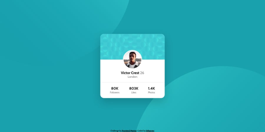
On mobile the background images don't look positioned correctly so maybe revisit that.
Looking at your html, there are some small learning points for you
- Think about how a screenreader would read out
alt="victor pfp". It would be better if that just had his name as the value - stats like 80k followers need to be in one meaningful html tag together. It doesn't make sense to have them in separate tags. You could use spans inside a meaningful element for styling
- similarly,
<small>has meaning and shouldn't be used in this context. Use classes for styling, not elements like this unless the meaning is for text to be minor/supplementary
Keep on coding! ☺
1
ps. If you want ideas of how to position those bg circles in a way that works for all screen sizes, have a look at my solution, see if that helps
1
Kit Harvey• 170
@kitharvey
Posted
@grace-snow Thank you for the feedback. This is the first time I heard these great tips, again, thank you. I will apply these and make changes.
0
