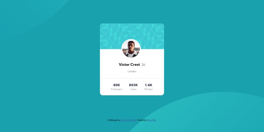
Design comparison
SolutionDesign
Solution retrospective
This is a mobile-first approach
Community feedback
- @SamadeenPosted about 3 years ago
Hey!! Cheers 🥂 on completing this challenge.. . Here is my suggestion You should adjust the color of your heading to a lighter text.. . Regardless you did amazing.. Happy coding!!!
0 - @Akhlak-Hossain-JimPosted about 3 years ago
hey, renzzzz. great work so far.
I just saw the preview and the code, here are some of my suggestions.
- try first heading as
h1 - try learning and using CSS variables.
- try learning Sass or some frameworks/libraries.
Happy coding :)
0 - try first heading as
Please log in to post a comment
Log in with GitHubJoin our Discord community
Join thousands of Frontend Mentor community members taking the challenges, sharing resources, helping each other, and chatting about all things front-end!
Join our Discord
