

Design comparison

Solution retrospective
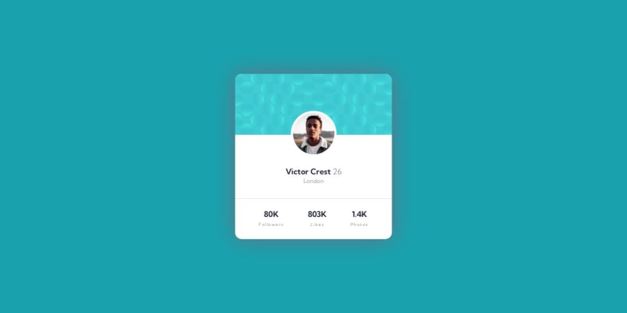
Found it difficult to put the given svgs as background.
Community feedback
- @vanzasetiaPosted over 1 year ago
Hi, Hengul Akash! 👋
For those background patterns, I recommend showing them with pseudo-elements and positioning them with absolute positioning. You can see Grace's solution for your reference: Frontend Mentor | Profile card with pseudo backgrounds and accessible list coding challenge solution
Here are some suggestions for improvements:
- Readable alternative text: Alternative text should not be hyphenated.
- Wrap the text with a meaningful element: For example, use a paragraph element to wrap the text. There should not be text in
<span>and<div>alone. <section>needs a heading: Only use<section>or<article>if you make sure that a heading will be inside it. Otherwise, just use a<div>. Learn more about<section>and<article>— WebAIM: HTML Semantics and Accessibility Cheat Sheet- CSS reset: Use a CSS reset whenever you start a new project. This can help you set the styling foundation easily. My recommendation — A Modern CSS Reset | Andy Bell
- Do not use pixel unit for font sizes: Use
remoreminstead ofpxfor font sizes. Never usepxunit. Relative units such asremandemcan adapt when the users change the browser's font size setting. Learn more — Why you should never use px to set font-size in CSS
I hope this helps. Happy coding! 🙂
Marked as helpful1 - @0xabdulkhaliqPosted over 1 year ago
Hello there 👋. Congratulations on successfully completing the challenge! 🎉
- I have other recommendations regarding your code that I believe will be of great interest to you.
BACKGROUND iMAGE 📸:
- Looks like the background images has not been set yet, So let me share my css snippet which helps you to easily apply the
background colorwith thebackground svgthey provided to place perfectly as same as design.
- Add the following style rule to your css, after completing these steps you can experience the changes.
body { background: url(./images/bg-pattern-top.svg), url(./images/bg-pattern-bottom.svg); background-position: right 52vw bottom 35vh, left 48vw top 52vh; background-repeat: no-repeat, no-repeat; background-color: hsl(185deg, 75%, 39%); }- Tip, Don't forget to generate a new screenshot after editing the
cssfile
.
I hope you find this helpful 😄 Above all, the solution you submitted is great !
Happy coding!
1


Please log in to post a comment
Log in with GitHubJoin our Discord community
Join thousands of Frontend Mentor community members taking the challenges, sharing resources, helping each other, and chatting about all things front-end!
Join our Discord