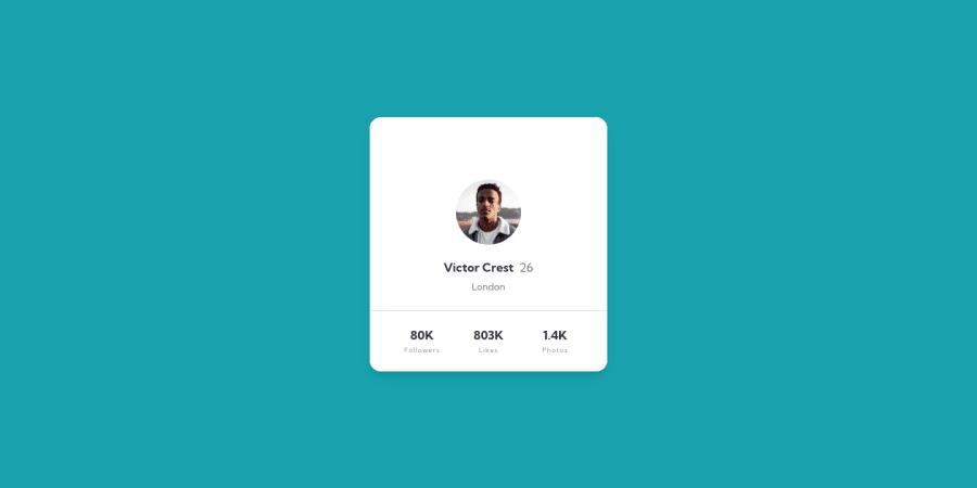
Design comparison
Solution retrospective
Sorry for uploading something that looks incomplete. It is complete, but this is my first time using Tailwind and I've not figured out how to link the CSS. I've been struggling with this for the last 4 - 5 hours so any help would be greatly appreciated.
Community feedback
- @markup-mitchellPosted over 3 years ago
I'm sort of astounded by how little structure there is here, in terms of actual elements I mean. It's impressively minimal, but I wonder how someone using, say, a screen reader would understand the content.
The user name is a heading, but then everything else is just paragraphs. I think it is possible to infer what everything means, just about, but it'd be difficult. (I'm just thinking aloud here, BTW - parsing this design into semantic HTML is tough; I spent ages figuring something out! 🙂)
Anyway, to answer your question - you said CSS, but I guess you mean SVG? I don't know why the background-images aren't working; changing the filepath from
/to./didn't work the way I thought it would.You could try extending your config if you want to adhere strictly to the utility-first approach, but if I were you I'd just slap
style="background-image: url(./images/bg-pattern-card.svg)"straight into<main>.Marked as helpful1@BenConfigPosted over 3 years ago@markup-mitchell Hi Mark, thank you for commenting on my project.
I generally try to keep the HTML as simple as possible. I'm not sure exactly how screen readers work to be honest, but it's something I've been meaning to investigate. Though I do try to use semantic HTML wherever possible.
I think every page must have an
h1element, so the name was the most obvious choice for this. Thinking about it now, I could have made 'Profile Card Component' anh1and visually hidden this. Which elements would you suggest instead of paragraphs? They are semantic and I don't see what the alternative is. I think what might be confusing to screen readers is how I have put, for example '80K' in oneptag and 'Followers' inside anotherptag, when really they are part of the same block of text.Actually at first it was not showing the CSS, it was only showing the HTML with the default browser styles. I later managed to get the CSS linked (although still not sure if it's done in the correct way) and it's only the background images missing now. I did actually 'extend the config' for the background and they were showing up offline, it was only when I uploaded on to GitHub that the background images weren't linked properly and not showing. I did think about using inline styles, but I would rather try and figure this out.
I'm having a couple of weeks off from using Tailwind. I actually find it quite straightforward to use, the only problem I'm having (as you can see) is linking the files properly and the general file structure. I think I'm going to try a different project with Tailwind then come back to this one to sort it out.
Right now I'm working on the Tip Calculator App challenge so should have the solution for that uploaded later tonight.
0 - @markup-mitchellPosted over 3 years ago
"I think every page must have an h1 element, so the name was the most obvious choice for this."
Yeah, i think that's right. And i reckon if your card was an
<article>nested under<main>then the<h1>would be valid for the component wherever it was used in a page.I ended up making "followers", "likes" and "photos" into level 2 headings, but it took me a lot of thought and testing to come to that conclusion.
I love using tailwind - all the best with it.
1
Please log in to post a comment
Log in with GitHubJoin our Discord community
Join thousands of Frontend Mentor community members taking the challenges, sharing resources, helping each other, and chatting about all things front-end!
Join our Discord
