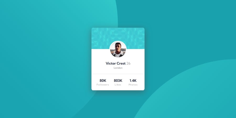
Design comparison
Solution retrospective
I'm especially proud of achieving a pixel-perfect design that closely matches the original layout while ensuring accessibility and readability. This was a rewarding test of my attention to detail and CSS skills.
Next time, I’d like to experiment with CSS animations or hover effects to enhance interactivity, and I’d also consider using CSS variables for font sizes to make the design more scalable. Additionally, I plan to explore using a CSS preprocessor like SASS to streamline my CSS structure further.
It’s always exciting to take on new challenges and build something better each time. Looking forward to more projects like this!
What challenges did you encounter, and how did you overcome them?One challenge was creating a responsive layout that would adapt seamlessly between desktop and mobile views. Balancing both CSS Grid and Flexbox was key here. I found that using CSS custom properties was incredibly helpful for managing theme colors and shadows, making adjustments more efficient.
Another challenge was positioning background images for the desired visual effect across all screen sizes. To overcome this, I experimented with background-size and background-position to ensure consistent placement without impacting the card's layout.
What specific areas of your project would you like help with?Responsive Design Tweaks: If the design could be smoother across different screen sizes, I’d appreciate tips on refining responsiveness, especially if you notice any areas where the layout or images could adjust better.
CSS Optimization: Feedback on how to make my CSS more maintainable or efficient would be valuable. If there are ways to simplify or refactor my code, especially in terms of variables, nesting, or reusable classes, that would be helpful.
Accessibility Improvements: Accessibility is essential, so if you notice any improvements I could make, like adjusting color contrast or enhancing keyboard navigation, I’d love insights on making the component more accessible.
Best Practices for Code Organization: If there are ways I could improve my code structure to be more modular or maintainable, I’d be interested in learning about that. For example, I’d appreciate advice on structuring CSS for scaling the project with more components in the future.
Suggestions for Interactivity: Since this component is relatively static, any ideas on adding subtle animations, transitions, or hover effects to improve the user experience would be great!
Community feedback
- @marliedevPosted 5 months ago
Hi! Overall it the solution looks great, but you could improve it in some ways:
- Modify alt attribute for Victor’s image to be more descriptive, e.g., alt="Portrait of Victor Crest", to give users better context.
- Add a <h1> tag for the main profile heading if this page stands alone or if "Victor Crest" is a prominent header. Avoid skipping heading levels for better screen reader navigation.
- Accessible Labels: Wrap the stats (followers, likes, photos) with appropriate labels for screen readers, such as aria-label or more descriptive text in the HTML itself.
- You could get rid of the fit-content property and add a width of 90% + a margin-inline:auto
0
Please log in to post a comment
Log in with GitHubJoin our Discord community
Join thousands of Frontend Mentor community members taking the challenges, sharing resources, helping each other, and chatting about all things front-end!
Join our Discord
