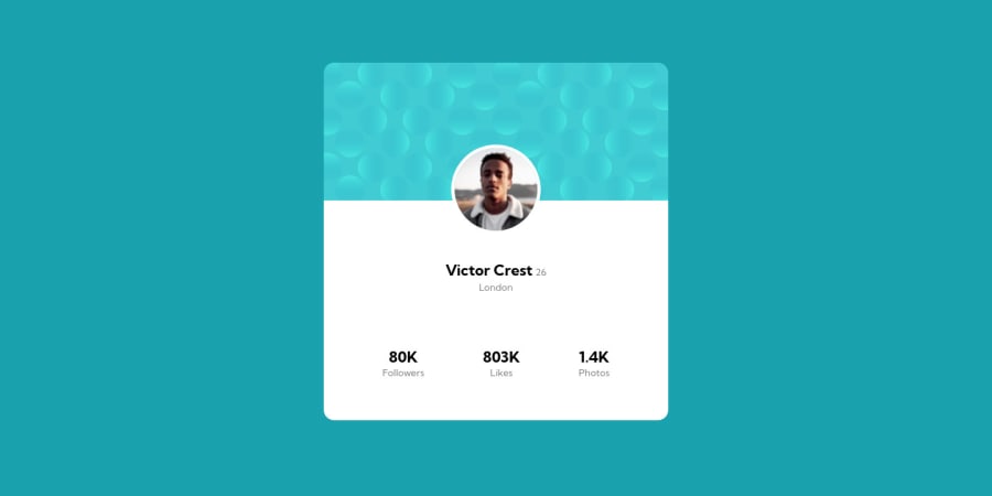
Design comparison
Solution retrospective
A decent attempt that would get me back to coding after a few days of sickness.
Still have a few todos for this one for sure in order to match the design.
Otherwise, let me know what else I can improve as always! Thanks guys.
Community feedback
- @correlucasPosted about 2 years ago
👾Hello Phúc, Congratulations on completing this challenge!
Here's one tip to help you to add the background:
To add the circles (bottom/top) in the background, the best way is by using
background-image
to manage it since adding them to thebody
you make sure it will be under everything, see the properties below and see that the comma inside each properties declare the single modification for each circle separated.body { background-color: hsl(185deg, 75%, 39%); background-image: url(./images/bg-pattern-top.svg), url(./images/bg-pattern-bottom.svg); background-repeat: no-repeat, no-repeat; background-position: top -427px left -20px, bottom -449px right -9px; display: flex; margin: 0; min-height: 100vh; justify-content: center; align-items: center; padding: 0 15px; }
✌️ I hope this helps you and happy coding!
1
Please log in to post a comment
Log in with GitHubJoin our Discord community
Join thousands of Frontend Mentor community members taking the challenges, sharing resources, helping each other, and chatting about all things front-end!
Join our Discord