Design comparison
Solution retrospective
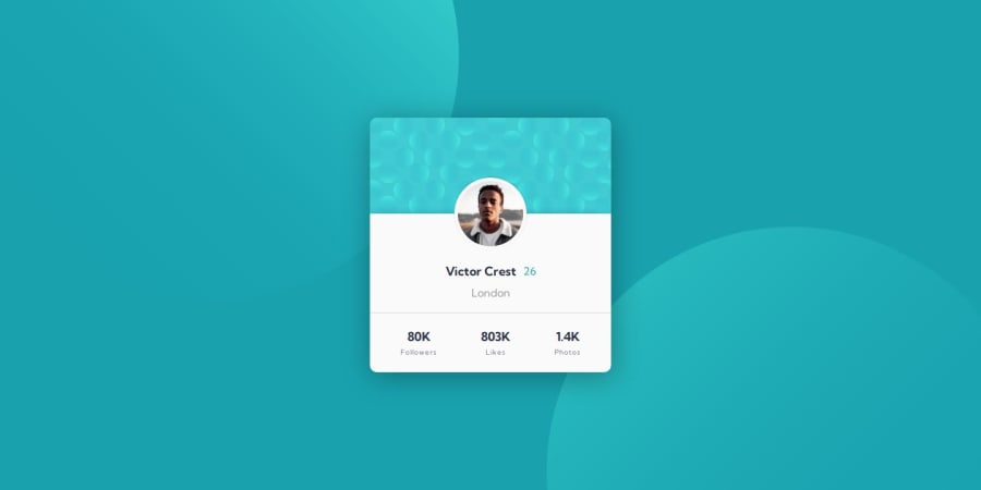
Profile card component👨🏽💻
Technologies used 🚀✨
- HTML🏗
- CSS️🎨
Features 🎯
- Semantic Arrangement✨
- Dynamic Animations🎭
- Prettier Arrangement🌈
You can check me out
Ready to tag along on my coding escapades? Join my adventure, where I challenge projects here.
🌌 Feel free to add your opinion about any possible improvements to the code and accessibility. 🙃
Community feedback
- @petritnurediniPosted 10 months ago
Congratulations on completing your profile card component! 🎉 It's great to see your project come to life. Here are some quick recommendations:
-
HTML Structure:
- Use more semantic HTML elements like
<header>
,<footer>
, and<section>
for improved accessibility and SEO. - Ensure all tags are properly closed for valid HTML syntax.
- Use more semantic HTML elements like
-
CSS Styling:
- Consolidate CSS rules and remove redundant properties for cleaner and more maintainable code.
- Consider using CSS preprocessors like Sass for more efficient styling management.
-
Responsive Design:
- Test your layout across various devices and screen sizes to ensure consistent and optimal display.
- Utilize CSS Flexbox or Grid for flexible and responsive layouts, especially for larger screens.
-
Accessibility:
- Provide alternative text for images using the
alt
attribute to enhance accessibility for users with disabilities. - Check color contrast ratios to ensure readability, particularly for users with visual impairments.
- Provide alternative text for images using the
-
Animation:
- Experiment with CSS animations to enhance user experience and engagement, but ensure they're not overly distracting.
Keep up the excellent work! Your dedication to learning and improving your skills is inspiring. 💪
For further learning resources, check out:
0 -
- @danielmrz-devPosted 10 months ago
Hello @iamupo!
Your solution looks great!
The background pattern with the circles is a bit tricky, but here's how you can do it:
📌 You don't need to use
::before
and/or::after
because it's possible to work with multiple background images at the same time. Add this to the body:background-color: var(--Dark-cyan); background-image: url("./images/bg-pattern-top.svg"), url("./images/bg-pattern-bottom.svg"); background-repeat: no-repeat, no-repeat; background-position: right 52vw bottom 35vh, left 48vw top 52vh;
I hope it helps!
Other than that, you did an excelent job!
0
Please log in to post a comment
Log in with GitHubJoin our Discord community
Join thousands of Frontend Mentor community members taking the challenges, sharing resources, helping each other, and chatting about all things front-end!
Join our Discord