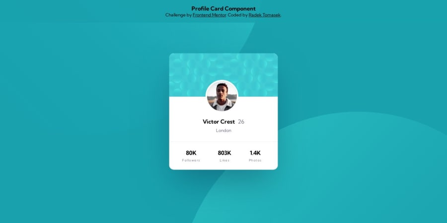
Design comparison
SolutionDesign
Solution retrospective
Hello 👋,
I am submitting another little challenge. Although the project was very simple in terms of complexity, I spent a bit more time with the implementation as I was learning and applying some new things, including:
- Using a Modern CSS Reset by Andy Bell
- Applied CSS Nesting.
- Aligned CSS units more precisely. Previously, I used
remfor most things, but it makes sense to keepremprimarily forfont-sizesand use theemsforwidth/heightsandpxfor some small units (letter-spacings,borders). - Regarding colors, I also changed the definition and started using the more compact form for the variables containing just the value (e.g 228 9% 92%). The advantage of this approach is that once it's used, it can be just easily wrapped by
hslwith opacity set as an extra value, e.g.hsl(var(--color-variable) / .7);.
It was fun to implement this project too. The only extra challenge for me was to try to position the background images as precisely as possible to the original Figma. It's probably slightly off, but I am happy with the result in general.
Community feedback
Please log in to post a comment
Log in with GitHubJoin our Discord community
Join thousands of Frontend Mentor community members taking the challenges, sharing resources, helping each other, and chatting about all things front-end!
Join our Discord
