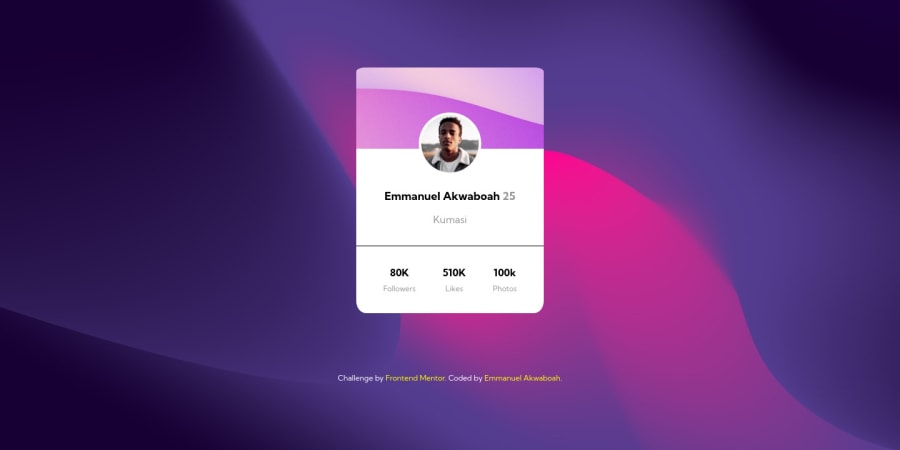
Design comparison
Solution retrospective
It took me a day to finish this one and the most challenging part was centering the card. Positioning the image was also challenging.
Either way I did it and I am ready for any feedback. Help me improve.
Thank you!
Community feedback
- @OmarCypha700Posted over 2 years ago
Wonderful design Cyrus. I like your customization. Personally I think you used too many elements to build this card which makes it harder to manage at some point. Also, I suggest you use media queries in your css to change the style at specific screen sizes. Using units in percentages and rem is also great. It helps in making it responsive.
Overall, great design great code π. Hope this helps.
1@Cyrus-Akwaboah-EmmanuelPosted over 2 years ago@OmarCypha700 thanks for the feedback
1 - @AdrianoEscarabotePosted over 2 years ago
Bro how did you make these wave effects in the background, was it using figma or some similar online graphics editor ?
I really liked the colors used and your code was very good.
I just think that it lacked a little care in making the responsiveness of the card, galaxy fold users who would visit would see the content a little broken. You could have used a media query that, when it reached a cell size, changed the media unit to percentage, making the card as responsive as possible.
But the rest is very good. Congratulations π₯³
1@Cyrus-Akwaboah-EmmanuelPosted over 2 years ago@AdrianoEscarabote the background is an abstract wallpaper background from unplash.com. I'll fix the responsiveness.
Thank you for the feedback back.
0 - @correlucasPosted over 2 years ago
πΎHello Emmanuel, congratulations for your solution!
I liked a lots the customization you've done and the color of the background!
I've some tips for you about your code:
You've added too much elements to build this card, look that you don't need so many blocks to hold its contents, you can wrap everything in the main for example, one div for the header and another for the stats section. If you add to much stuff this gets harder to manage all the content because of the amount of divs you've.
To allow your container to be responsive, isn't a the best choice use
min-width
for the card, is better you usemax-width
to allow it scale down when the screen gets small.Hope it helps and happy coding!
1@Cyrus-Akwaboah-EmmanuelPosted over 2 years ago@correlucas thanks for the feedback. I'll look into it again.
1
Please log in to post a comment
Log in with GitHubJoin our Discord community
Join thousands of Frontend Mentor community members taking the challenges, sharing resources, helping each other, and chatting about all things front-end!
Join our Discord